
Google Ads Reporting: How to Build Reports That Actually Show What’s Working (2026)
 Jignesh Vagadiya
19/08/2026
21 min read
Jignesh Vagadiya
19/08/2026
21 min read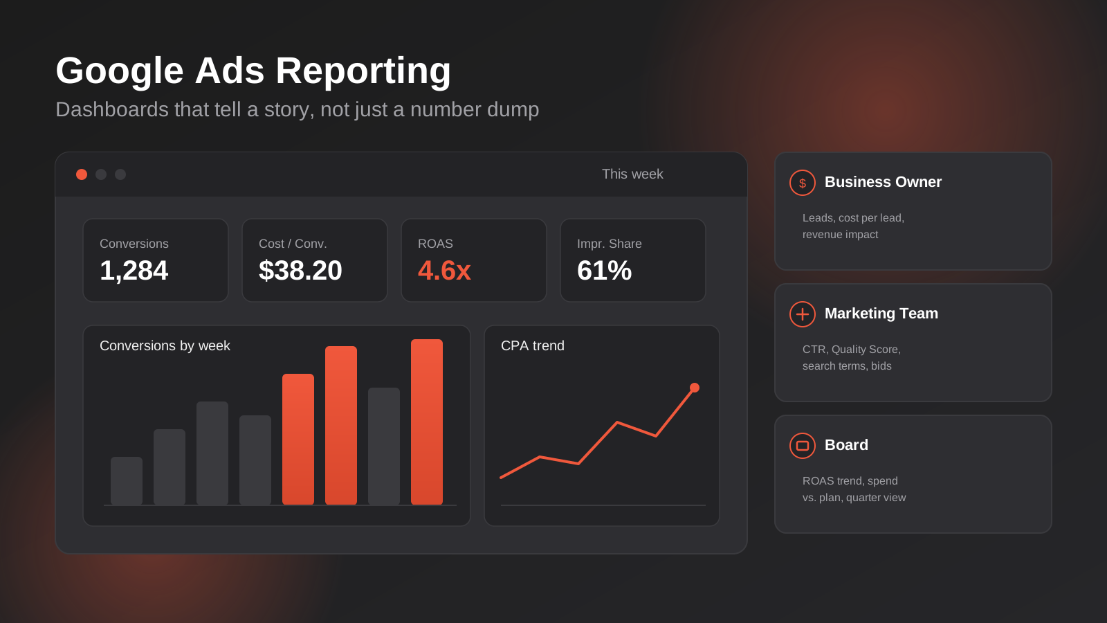
Most Google Ads accounts we take over already have a reporting habit — a monthly PDF, a shared spreadsheet, a Looker Studio link nobody opens. What they don’t have is a reporting framework: a deliberate answer to who reads this, what decision it’s meant to support, and what “good” looks like against a benchmark. Without that, reporting becomes a compliance exercise. Numbers go out, nobody argues with them, and nothing about the campaign changes as a result.
This isn’t a piece about which metrics matter or how conversion tracking works — we’ve covered the strategy side of that in our guide to Google Ads ROI in Australia, including Smart Bidding and how conversion data actually gets used by the algorithm. This is the operational half: how to build a reporting system that a business owner, a marketing manager and a board member can each open and immediately understand what’s working, what isn’t, and what happens next.
Why Most Google Ads Reports Get Ignored
Ask most business owners what their Google Ads report told them last month and you’ll get a version of “spend was up, clicks were up, I think it’s going okay.” That’s not a criticism of the business owner — it’s what happens when a report is built to demonstrate activity rather than to communicate performance. A table with fourteen columns of impressions, CTR, average CPC, Quality Score and impression share doesn’t fail because the numbers are wrong. It fails because nobody told the reader which three numbers actually decide whether the account is doing its job.
We see three recurring failure patterns when we audit reporting from other agencies or in-house teams.
The first is the data dump. Every available metric gets exported into a table because more data feels safer than less — if something goes wrong later, at least it was “in the report.” The problem is that a reader can’t extract a decision from forty rows of numbers under time pressure, so they skim, absorb nothing, and file it away unread. The second is the single-audience report, where one document gets sent to everyone regardless of what they actually need from it. A board member doesn’t want segmented device-level CTR, and a performance marketer doesn’t want a one-line summary that says “campaigns performed well.” The third, and the most damaging, is reporting with no reference point — a column of numbers with nothing to compare them to. A conversion rate of 4.2% means nothing on its own. Is that up or down on last month? Above or below what the account has historically delivered? Better or worse than what the category typically sees? Without a benchmark, every number is just a number.
Fixing this doesn’t require more data. In most cases it requires less — but organised around a reader and a decision, not around what the platform happens to export.
There’s also a trust cost to bad reporting that’s easy to underestimate. When a client or a manager can’t quickly extract a decision from a report, they stop reading it closely, and once that happens they stop trusting the account is being actively managed at all — regardless of how much genuine optimisation work is happening behind the scenes. We’ve taken over accounts that were performing reasonably well on the platform side but had lost the client’s confidence entirely, purely because the reporting made good work invisible. Reporting isn’t just a record of performance; for most clients, it’s the only visible evidence that the account is being managed at all.
This is worth stating plainly because it changes how reporting should be treated internally. It isn’t an administrative task to knock out at the end of the month once the “real” work is done — the strategy, the bid changes, the creative testing. It’s the mechanism through which everything else gets evaluated, funded, and continued. An account manager who treats reporting as an afterthought is, in effect, leaving the value of their own work to chance.
Start With the Audience, Not the Metrics
The single biggest change we make when we inherit a reporting setup is refusing to build one report for everyone. A business owner, an in-house marketing manager and a board or investor audience are asking fundamentally different questions of the same account, and a report that tries to satisfy all three at once usually satisfies none of them well.

The Business Owner: Is This Making Me Money?
A business owner — particularly one running a trades, retail or professional services operation — wants to know one thing before anything else: is the money going into Google Ads coming back out, and by how much. Everything else is detail they’ll ask about if they’re curious, not detail they need up front.
The KPIs that matter here are cost per lead or cost per sale, total leads or sales for the period, return on ad spend expressed in dollars rather than a ratio (an owner understands “we spent $8,200 and generated $41,000 in tracked revenue” faster than a 5:1 ROAS figure), and a plain-English note on trend direction. Anything below that — impression share, Quality Score, device segmentation — belongs in an appendix they can look at if they want to, not the first thing they see. Business owners are usually reading this report on a phone between jobs. If it takes more than sixty seconds to understand whether last month was good or bad, the report has failed regardless of how accurate the underlying data is.
The Marketing Team: What Do We Change Next?
An in-house marketing manager or a marketing team is reading the same account with a completely different job to do. They need enough granularity to make a decision about budget allocation, creative refresh, or bid strategy adjustment — not just to know whether the month was good, but why, and what to do about it next.
This audience wants campaign and ad group-level performance, search term and audience insights that reveal where waste is happening, Quality Score and impression share trends that flag structural issues before they show up in cost, and a clear view of what changed — new campaigns launched, bids adjusted, negative keywords added — against what actually moved as a result. This is the report where segmentation earns its place: by device, by campaign type, by geography, if the business operates across multiple locations. The test for whether something belongs in this report is simple — would a competent marketer change a decision based on seeing it? If not, it’s noise, even if it’s technically interesting.
The Board or Investor: Is This a Sustainable Channel?
A board, an investor group, or a senior executive one step removed from day-to-day marketing wants something closer to a strategic summary than an operational one. They’re not evaluating a single month in isolation — they’re evaluating whether paid search is a channel worth continued investment relative to everything else competing for budget.
This report should sit on a single page or slide wherever possible. It needs quarter-on-quarter or year-on-year trend lines rather than month-to-month noise, customer acquisition cost in the context of overall marketing spend and other channels, a plain statement of what’s driving performance change (market conditions, competitive pressure, seasonality, strategy shifts), and forward-looking commentary — what’s planned for the next quarter and what it’s expected to do to the numbers. Detail that would be essential in a marketing team report is a distraction here. A board doesn’t need to know which ad group underperformed; they need to know whether the channel, as a whole, is earning its place in the budget.
The Anatomy of a Report That Tells a Story
Once the audience is defined, the structure of the report itself needs to do more work than a spreadsheet export ever will. A report that “tells a story” isn’t a euphemism for making the numbers sound better than they are — it means the reader can follow a logical thread from headline result, to explanation, to action, without having to reconstruct that thread themselves from raw data.

Open With the Headline, Not the Setup
The first thing on the page should be the answer, not the working. State the headline result in one line — spend, key outcome, and direction of travel — before any chart or table appears. If a reader only sees the first sentence of the report, they should still walk away knowing whether the month was good, bad, or flat. Everything that follows exists to support or explain that opening line, not to build up to it.
Show the Trend, Not the Snapshot
A single month of data in isolation is close to meaningless in Google Ads, where seasonality, auction dynamics and even the day of the week a reporting period starts on can shift numbers materially. Every core metric should appear against at least a rolling six-month trend line, so a reader can see whether last month’s result is part of a pattern or an outlier. This is also where benchmarks belong — not as a separate section, but sitting directly next to the number they’re judging. A conversion rate chart with a dotted line showing the six-month average lets the reader assess performance in the same glance, rather than having to hold two numbers in their head from different parts of the document.
Explain the “Why” Before the Reader Has to Ask
Every meaningful change in the numbers should carry a one or two-line explanation next to it, written by the person who manages the account, not inferred by the reader from a chart. If cost per lead rose 18% in a month, the report should say why — a competitor entered the auction, a seasonal dip in search volume, a landing page change that affected conversion rate, a deliberate bid increase to protect impression share during a peak period. This is the section that separates a report from a dashboard. A dashboard shows what happened. A report explains it.
Close With What Happens Next
Every report should end with a short, specific list of actions — what’s being tested, changed, or watched over the next period, and why. This is the section that proves the report led somewhere, rather than existing as a record of a month that’s already over. It’s also the section most reports skip entirely, which is a large part of why they read as passive documentation rather than active account management.
Choosing a Reporting Cadence That Matches the Decision Being Made
One of the more common mistakes we see — on both the agency and in-house side — is applying a single reporting cadence to every audience and every decision. Reporting cadence should be set by how quickly a decision needs to be made with that data, not by habit or by what’s easiest to schedule.
Daily Monitoring, Not Daily Reporting
Someone should be looking at spend pacing, unusual cost spikes, and disapproved ads on a daily basis — but that’s monitoring, not reporting, and it shouldn’t generate a document. Daily check-ins exist to catch problems (a broken conversion tag, a budget cap hit at 9am, a policy disapproval on a high-spend ad) before they compound into a wasted week, not to produce something a client or manager reads every day. If daily numbers are being formally reported, the exercise usually collapses under its own noise — day-to-day fluctuation in a Google Ads account is normal and mostly meaningless in isolation.
Weekly, for Actively Managed or High-Spend Accounts
A weekly cadence suits accounts in an active testing phase, accounts with high enough spend that a week represents statistically meaningful data, or accounts where the marketing team is making frequent bid, budget or creative decisions and needs a tighter feedback loop than monthly reporting allows. Weekly reporting at this level tends to be lighter-touch and internal — a quick summary rather than a full formatted report — because its job is to keep the loop between action and result short, not to be a polished document.
Monthly, as the Default Standard
For most business owner and marketing team audiences, monthly is the right default. It’s long enough to smooth out weekly noise and short enough to catch problems before they become expensive. This is where the full structured report — headline, trend, explanation, next actions — earns its place, and it’s the cadence most of the audience-specific reporting described above should run on.
Quarterly, for Strategic Review
Board and investor-level reporting, along with any strategic account review — budget reallocation across channels, a shift in campaign strategy, a competitive repositioning — belongs on a quarterly cycle. Quarterly reporting should draw on the monthly reports that preceded it rather than being built from scratch, summarising the pattern across three months rather than re-litigating each one individually.
Building the Dashboard: Tools That Actually Support This
The framework above works whether it’s built in a slide deck, a PDF, or a live dashboard — but for most accounts we manage, a connected dashboard is worth the setup time because it removes the manual reporting labour that otherwise erodes cadence discipline over a busy month. Here’s how we typically build it.
Looker Studio as the Presentation Layer
Looker Studio (formerly Data Studio) is the tool we default to for client-facing dashboards because it’s free, it connects natively to Google Ads and GA4, and it can be structured into audience-specific pages within a single report file — a summary page for the business owner, a detailed page for the marketing team, without maintaining three separate documents. The most important discipline in building a Looker Studio dashboard isn’t the visual design, it’s resisting the platform’s own default behaviour, which is to let you drop in every available field as its own chart. The same audience-first thinking from earlier in this piece needs to be applied at the dashboard design stage, or Looker Studio just becomes a more attractive version of the data dump.
A few things we build into every dashboard as standard: a date range comparison control set to compare against the previous equivalent period by default (not an arbitrary custom range that changes what “up” or “down” means each time someone opens it), a scorecard row at the very top showing the three to five headline metrics for that audience before any chart appears, and calculated fields for the metrics that actually matter to the business — cost per lead, revenue per dollar spent — rather than relying on raw platform metrics that need mental math to interpret.
GA4 Integration for the Full Funnel
Google Ads data on its own only tells part of the story — clicks, cost, and platform-reported conversions. Pulling in GA4 alongside it closes the gap between what Google Ads claims and what actually happened on-site: bounce rate on the landing pages ads are sending traffic to, multi-session and assisted conversion paths where Google Ads played a role but wasn’t the final click, and engagement metrics that flag a disconnect between ad promise and landing page experience. This matters more than it sounds — we regularly find accounts where Google Ads reports a healthy conversion rate in isolation, but GA4 shows the traffic landing on a page with a 70%+ bounce rate, which points to a landing page or targeting mismatch that platform-native reporting alone would never surface.
The integration itself is straightforward through Looker Studio’s native GA4 connector, but it only adds value if conversion definitions are aligned between the two platforms first. If Google Ads and GA4 are tracking different events as “conversions,” or using different attribution windows, a combined dashboard just produces two sets of numbers that don’t reconcile — which erodes trust in the whole report faster than having no dashboard at all.
Google Sheets and Ads Scripts for the Gaps
Not everything worth reporting lives natively in Google Ads or GA4. Offline conversions — a phone call that converted to a sale three weeks later, a quote that closed in a CRM — usually need to be pulled in manually or via a scripted export into a Google Sheet that then feeds the dashboard. For accounts where this matters (most service businesses, trades, and B2B accounts fall into this category), we set up a simple Google Ads script that exports raw campaign data on a schedule into a sheet, which is then joined against CRM export data to build a true cost-per-sale figure rather than a cost-per-lead proxy. This is more setup work up front, but it’s the difference between a report that shows leads and a report that shows revenue — and revenue is what the business owner from the earlier section actually cares about.
Setting Benchmarks: What “Good” Actually Looks Like
Benchmarks are the piece most reporting setups skip entirely, and it’s the piece that makes every other part of the report meaningful. A conversion rate, a cost per lead, a click-through rate — none of these numbers mean anything to a reader in isolation. They only become useful once there’s something to measure them against, and there are three distinct types of benchmark worth building into a report, each answering a different question.
Historical Benchmarks: Is This Account Improving?
The most reliable benchmark for any account is its own history. A rolling six or twelve-month average for each core metric gives a reader an honest baseline that accounts for the account’s own seasonality, market position and audience — something an industry-wide average can never do. When cost per lead sits at $62 this month, the useful question isn’t “is $62 good for this industry,” it’s “is $62 better or worse than what this specific account has delivered over the last two quarters, and why.” Historical benchmarking is also the fairest way to judge a newly optimised account, because it measures the account against itself rather than against a market average that may include businesses with entirely different offers, price points or sales cycles.
Industry Benchmarks: Useful Context, Not a Target
Industry benchmark data — average CTR by sector, typical conversion rates for a given vertical — has a place in a report, but it belongs as context rather than as the standard an account is judged against. Published benchmarks are usually broad averages across thousands of advertisers with wildly different budgets, offers and account maturity, and treating them as a pass/fail line invites the wrong conversation. We use industry data mainly to sanity-check a number that looks unusual — if conversion rate is sitting well below the sector average, that’s a prompt to dig into landing page experience or targeting, not evidence on its own that the account is underperforming. The moment a client starts chasing an industry-average number for its own sake rather than their own commercial outcome, the benchmark has stopped being useful.
Target-Based Benchmarks: What Was Agreed Up Front
The most useful benchmark of all, and the one most reports leave out, is a target that was explicitly agreed with the client before the reporting period started — a maximum acceptable cost per lead, a minimum return on ad spend, a lead volume the sales team can realistically handle. Setting this target requires an honest conversation early in the relationship about margins, average order or contract value, and sales conversion rate from lead to close, so the number reflects real commercial constraints rather than an arbitrary round figure. Once that target exists, every report can state plainly whether the account is above, at, or below it, which turns the report from a description of activity into an accountability document — for the person managing the account as much as for the person reading it.
Common Google Ads Reporting Mistakes
- Leading with vanity metrics. Impressions and clicks are inputs, not outcomes. Leading a report with them — especially when they’re the biggest numbers on the page — implies they’re the measure of success, when what actually matters is what happened after the click.
- No benchmark or comparison point. A number with nothing to compare it to can’t be judged as good or bad. Every core metric needs a trend line, a prior period, or a stated target sitting next to it.
- Inconsistent date ranges month to month. Comparing a 31-day month to a 28-day month, or a period that includes a public holiday against one that doesn’t, distorts trend lines and erodes trust the first time someone notices.
- Mixing attribution models without saying so. Switching between last-click and data-driven attribution, or between Google Ads-reported and GA4-reported conversions, without flagging the change makes month-on-month comparisons meaningless and is one of the fastest ways to lose a client’s confidence in the numbers.
- Reporting activity instead of outcomes. “We launched 3 new campaigns and added 40 negative keywords” is work done, not a result. It belongs in the explanation section, not as a substitute for a performance headline.
- One report for every audience. A single document trying to satisfy a business owner, a marketing team and a board simultaneously ends up too shallow for the technical reader and too dense for the executive one.
- No stated next action. A report that doesn’t end with what’s changing next reads as a record of a month that’s already over, rather than evidence of active account management.
- Cherry-picked time windows. Zooming into the best week of the quarter to make a chart look better is the fastest way to destroy credibility once a reader checks the underlying data themselves.
Frequently Asked Questions
How often should I actually receive a Google Ads report?
For most businesses, monthly is the right default for a full, structured report. High-spend or actively-tested accounts often benefit from a lighter weekly summary as well, but daily reporting is rarely useful — day-to-day account fluctuation is normal and reporting it formally usually just adds noise without adding a decision.
What’s the difference between a dashboard and a report?
A dashboard shows what happened — live or near-live numbers a reader can explore themselves. A report explains why it happened and what’s being done about it. The strongest reporting setups use both: a dashboard for ongoing visibility, and a periodic written report that adds the narrative a dashboard can’t provide on its own.
Do I need Looker Studio, or is a spreadsheet good enough?
A well-structured spreadsheet can absolutely work for a smaller account, particularly early on. Looker Studio earns its place once you’re managing multiple audiences, want automatic date-range comparisons, or need to blend Google Ads with GA4 and other data sources without manually exporting and reconciling numbers every reporting period.
Why does my Google Ads dashboard show different conversion numbers to GA4?
This almost always comes down to differing conversion definitions or attribution windows between the two platforms — Google Ads and GA4 don’t automatically agree on what counts as a conversion or which click gets credit for it. Before combining them in one dashboard, align what each platform is counting, or the discrepancy will keep undermining confidence in both numbers.
What KPIs should be on a one-page report for a business owner?
Cost per lead or cost per sale, total leads or sales for the period, return on ad spend expressed in dollar terms, and a plain-English note on trend direction. That’s usually enough for an owner to judge whether the month was good, bad, or flat — anything more technical can sit in an appendix for those who want to dig further.
How do I track offline conversions like phone calls or quotes that close later?
Offline conversion tracking typically involves capturing a Google Click ID (GCLID) at the point of the initial online interaction, then uploading the outcome — a closed sale, a qualified quote — back into Google Ads once it’s known, often via a CRM integration or a scheduled import. It takes more setup than standard on-site conversion tracking, but for service businesses where the sale happens well after the click, it’s usually the only way to report on genuine cost-per-sale rather than a lead-based proxy.
Where to Start
If your current Google Ads reporting is a monthly export nobody reads in full, the fastest fix isn’t more data — it’s rebuilding around a specific reader and a specific decision. Start by defining who actually needs to see the numbers and what they’re deciding based on them, strip the report back to the handful of metrics that answer that question, and add the trend lines and benchmarks that let a reader judge the numbers without having to ask you first.
If you’d rather have that framework built for you — a proper Looker Studio dashboard connected to Google Ads and GA4, structured by audience, with a reporting cadence that matches how your business actually makes decisions — that’s exactly the kind of setup we build for clients as part of ongoing Google Ads management, priced on our Google Ads pricing page. Get in touch and we’ll show you what it could look like for your account.
Keep reading
Related posts
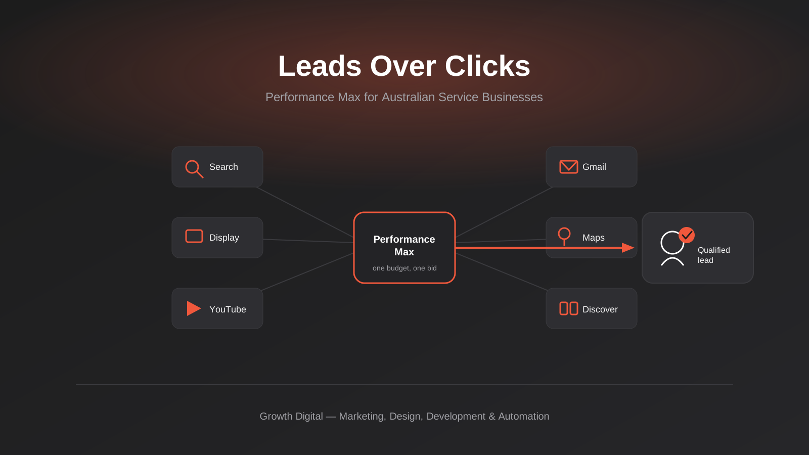
Performance Max for Lead Generation: A 2026 Guide for Australian Service Businesses
Performance Max for lead gen needs different conversion tracking and asset groups than ecommerce PMax. How Australian service businesses should set it…
Microsoft Advertising (Bing Ads) for Australian Businesses: Cost, LinkedIn Profile Targeting and the Google Ads Import Trap (2026)
What Microsoft Advertising actually costs in Australia, how LinkedIn profile targeting works for B2B, and what breaks when you import from Google…

Google Ad Grants for Australian Non-Profits: Eligibility, Application and the Rules That Keep It Alive (2026)
A practical guide to Google Ad Grants for Australian non-profits: who qualifies, how to apply, and the compliance rules that keep the…
Got a project you'd like to talk through?
Tell us what you're working on — we'll come back with a plan.
