
Dark Patterns in Website Design: What Australia’s Unfair Trading Practices Law Means for Your Site
 Jignesh Vagadiya
21/10/2026
21 min read
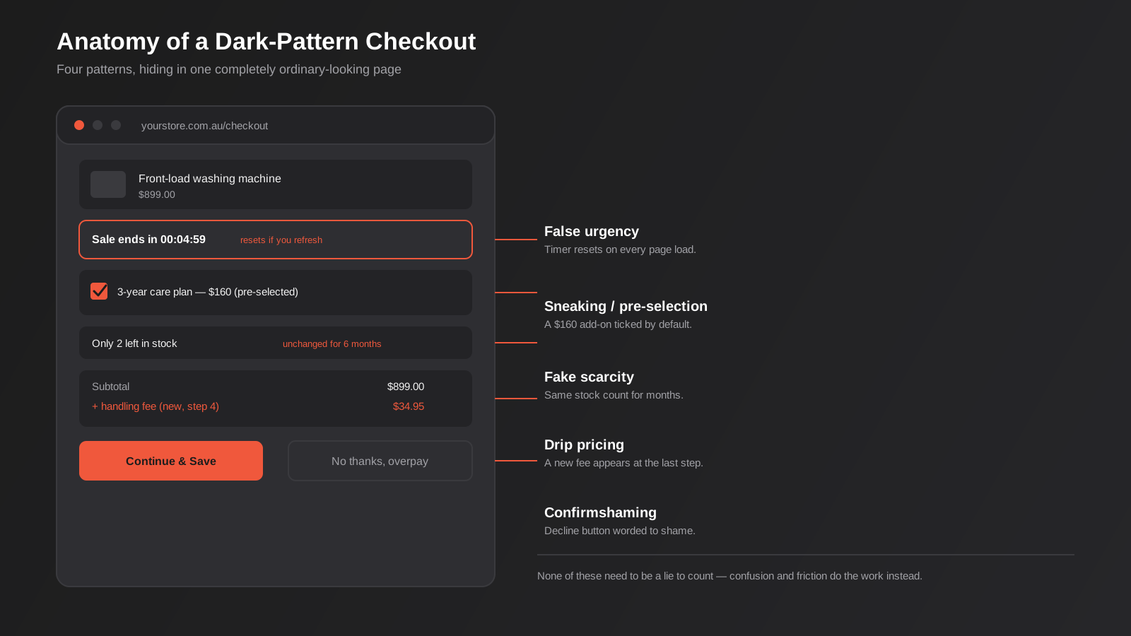
Add a washing machine or a fridge to your cart on a few of the big Australian appliance retailers and you’ll notice something already ticked for you before you reach checkout: a $100–$200 “care plan” or extended warranty, bundled in by default, that you have to actively notice and remove. It’s not an accident. It’s one of ten dark patterns in website design that a 2022 Consumer Policy Research Centre study found scattered across Australian ecommerce sites, and it’s the kind of thing that’s about to stop being a grey area.
Australia is in the middle of introducing an economy-wide ban on unfair trading practices — a broader, blunter instrument than the misleading-and-deceptive-conduct rules businesses have worked under for decades. Government commentary around the reform has explicitly called out dark patterns as a target: pre-ticked add-ons, fake urgency, subscriptions that are easy to start and hard to leave. None of that needed to be dishonest to be a problem under the proposed test, which is the part catching a lot of design and marketing teams off guard.
This isn’t a legal bulletin dressed up as a blog post. It’s a practical look at which common design and conversion tactics now sit on the wrong side of the line, how to audit your own site for them, and what you build instead that still performs. We work on checkout flows, forms and conversion-focused redesigns for a living, so this is written from that angle — not from a law firm’s, and not as a scare campaign about a reform that’s still making its way through Parliament.
What a Dark Pattern in Website Design Actually Is (and Isn’t)
“Dark pattern” gets thrown around loosely enough that it’s worth pinning down before anything else. It’s not a term for persuasive design in general — a well-placed testimonial, a genuinely limited sale, a simplified form aren’t dark patterns just because they’re effective. The term describes an interface deliberately structured so that the easiest, most obvious path leads somewhere the user wouldn’t choose if the choice were presented plainly. The harm isn’t that you’re trying to influence a decision — every piece of commercial design does that. It’s that the interface is working against the user’s actual intent rather than helping them act on it.
Regulators and researchers group these patterns a handful of ways, but for a website or checkout audit, four buckets cover almost everything you’ll find.
Pricing and cost traps
This is the category with the clearest existing legal exposure, because Australian Consumer Law already has drip pricing provisions on the books. Hidden fees that only appear on the final checkout screen, mandatory add-ons presented as optional, and “from $X” headline prices that no real customer ever actually pays all sit here. The pre-ticked care plan example above is the textbook case: the box is there, it’s legally an opt-in, and almost nobody notices it in time to opt out. A related version shows up more in travel, events and some SaaS pricing — a headline price that only covers the base product, with “booking fees”, “service fees” or mandatory add-ons stacked on progressively through the funnel, so the number you see in search results or an ad is never the number you actually pay. Component pricing of that kind isn’t automatically illegal on its own, but it gets risky fast once the gap between the advertised figure and the real total becomes the norm rather than the exception.
False urgency and scarcity
Countdown timers that reset the moment you close and reopen a tab. “Only 2 left in stock” badges that show the same number for months. A banner claiming “14 people are viewing this right now” generated by a plugin rather than by actual visitor data. Genuine scarcity — a real sale end date, a real low-stock count pulled from inventory — is fine and always has been. The pattern is specifically the fabricated version, built to create pressure that doesn’t correspond to anything real.
Subscription and cancellation traps
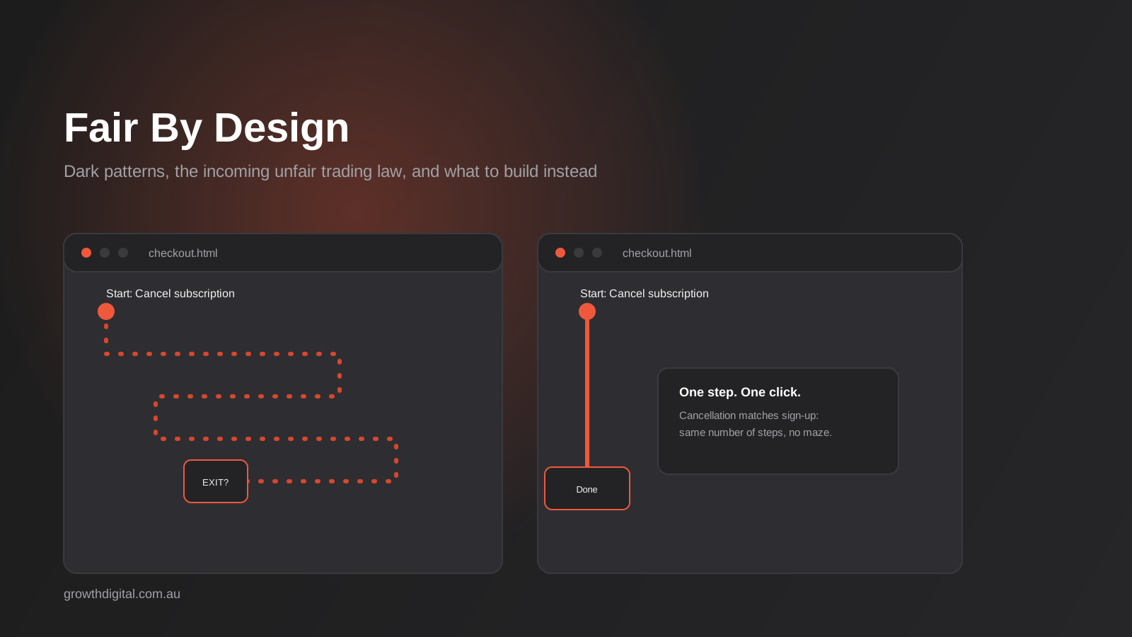
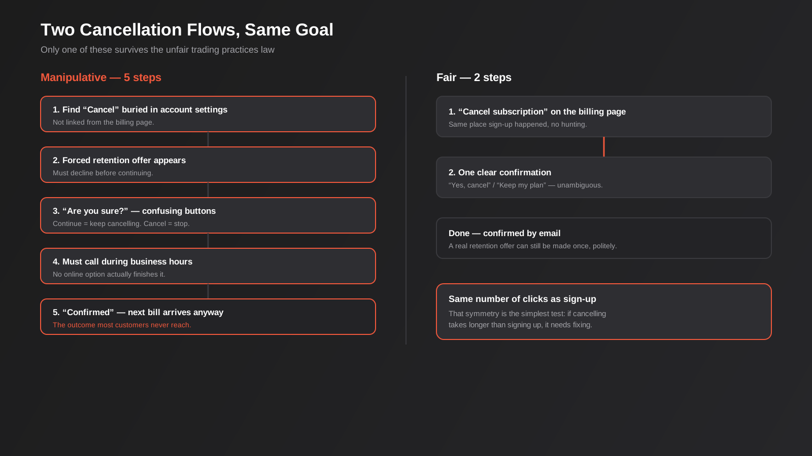
Sometimes called the “roach motel” or “Hotel California” pattern — easy to check in, deliberately hard to check out. Sign-up takes one click and a credit card number; cancellation requires finding a hidden menu, calling a phone line only staffed during business hours, or confirming three times through a flow designed to make “Cancel” and “Continue” look confusingly similar. This is one of the two areas the proposed law specifically names, alongside drip pricing, which tells you where enforcement attention is likely to land first.
Interface interference and trick questions
Confirmshaming — a decline button worded as “No thanks, I don’t want to save money” instead of a plain “No thanks”. Nagging pop-ups that reappear after every dismissal, worded to wear down resistance rather than inform. Trick questions where a double negative or a confusingly worded checkbox makes it genuinely unclear what ticking it does. None of these require a lie, exactly — they rely on confusion and friction doing the persuading instead of an honest pitch. A related version worth checking separately is “sneaking” — items quietly added to a cart or booking during an unrelated step, like a donation or an insurance product inserted between selecting a flight and reaching payment, where the add-on rides along on a step the customer wasn’t focused on at all.
Why This Is Suddenly a Legal Problem, Not Just a Design Opinion
Australian Consumer Law has always prohibited misleading or deceptive conduct, and a genuinely fake countdown timer or a fabricated stock counter can already fall foul of that if you could prove the deception. In practice, proving deception is hard and slow, and a lot of dark patterns are designed to sit just inside a technical truth — the box is disclosed somewhere, the cancellation path does technically exist — while still steering behaviour unfairly. That gap is exactly what the new reform is aimed at closing.
The Competition and Consumer Amendment (Unfair Trading Practices) Bill has moved through an exposure draft and introduction to Parliament during 2026 (see the Parliamentary Library’s Bills Digest for the detail), with the new prohibitions set to commence from 1 July 2027. Rather than requiring proof of dishonesty, it introduces a broader “unfair” standard — conduct that materially distorts or is likely to distort a consumer’s decision-making, even where nothing said was technically false. Alongside the general prohibition, the bill carries specific, named rules on unfair subscription practices and stronger drip-pricing protections, which is a direct signal that checkout and cancellation flows are the first places scrutiny will land. A related bill doubling maximum Australian Consumer Law penalties to up to $100 million per contravention has already passed, so the cost of getting this wrong is rising independently of the unfair trading reform itself.
None of this is theoretical consumer advocacy chatter. The Consumer Policy Research Centre’s 2022 research found roughly one in five Australians had spent more than they intended because of a web or app design, and almost one in six felt pressured into a purchase by one. That survey is part of the evidence base regulators have pointed to in building the case for reform, which is worth knowing if you’re trying to gauge how seriously to take this rather than filing it under “law firms selling anxiety.”
How enforcement is actually likely to work
Nobody’s going to crawl every Australian checkout flow on commencement day. In practice, enforcement under reforms like this tends to follow a predictable pattern: consumer complaints flagging a specific business, advocacy groups like the Consumer Policy Research Centre running their own audits and naming names the way the 2022 report already did, and the regulator picking a handful of visible cases to pursue as a deterrent rather than chasing every minor breach. That means your actual risk is weighted toward high-traffic pages, well-known brands, and anything that generates enough customer complaints to get noticed — which is exactly why checkout and subscription flows, the pages every customer touches, are the sensible place to start rather than a low-traffic page nobody complains about.
What’s genuinely still fine
It’s worth saying plainly what this doesn’t touch, because the alternative is agencies and business owners swinging too far the other way and stripping out everything persuasive. A real limited-time offer with a real end date is fine. A genuine low-stock warning pulled from your actual inventory system is fine. Asking for an email address before someone downloads a guide is fine. Testimonials, case studies, clear pricing tiers and a well-argued value proposition are not dark patterns — they’re just marketing, and none of the current commentary around the reform suggests ordinary persuasive design is at risk. The line is honesty and clarity, not persuasiveness.
The Dark Pattern Audit: Walking Your Own Site Like a Regulator Would
You don’t need a law degree to run this yourself. Go through each of the four areas below on your own site, ideally on a phone, and actually try to complete the flow — add to cart, start a subscription, request a cancellation — rather than just reading the copy. Reading your own site’s copy tells you what you intended to build. Clicking through it as a stranger tells you what you actually built, and the two are rarely identical once a page has been edited by three different people over a year.
Pricing and checkout pages
Add your most popular product or service to the cart and go all the way through to the final price before payment. Is every fee visible from the first price you saw, or does something new appear at the last step? Is anything pre-selected — an extended warranty, a “recommended” upgrade, a donation, insurance — that you’d need to notice and manually remove? If a reasonable person could complete checkout without ever consciously deciding to buy that add-on, it’s a problem regardless of whether a checkbox technically existed.
Subscription and cancellation flows
Time how long sign-up takes versus cancellation. If starting a subscription is three clicks and cancelling requires finding a support email, waiting for a reply, or navigating past a “are you sure?” screen with a confusing button layout, that asymmetry is precisely what the subscription-specific provisions in the new bill are built to catch. A fair test: could you describe the cancellation path to someone over the phone in one sentence? If it takes a paragraph, it’s too hard.
Cookie and consent banners
Check whether “Accept all” is a large, high-contrast button while “Reject” or “Manage preferences” is a small grey link, or buried behind a second click. This pattern sits closer to privacy law than consumer law strictly speaking, but it’s the same underlying problem — a consent mechanism engineered to produce one outcome regardless of actual preference — and it’s one of the first things an outside reviewer will notice because it’s visible on every single page.
Account deletion and data requests
Try to find where a user deletes their account or requests their data, without using search. If it’s not reachable from account settings within two clicks, or if deletion requires emailing a support address and waiting, that’s functionally the same cancellation-asymmetry problem applied to data rather than billing, and it’s increasingly on regulators’ radar alongside Privacy Act obligations, not just consumer law.
If this audit turns up more than a quick fix — a checkout that needs real restructuring, a cancellation flow that needs rebuilding rather than relabelling — that’s the point where it stops being a copywriting exercise and becomes a proper conversion-focused design project, because the fix usually touches the underlying flow and data, not just the wording on a button.
What to Do Instead: Persuasion That Still Converts
The honest version of most dark patterns isn’t weaker, it’s just slower to set up properly. The difference is whether the pressure or the proof is real.
Real urgency instead of fabricated urgency
If you run a genuine end-of-financial-year sale, say when it ends and actually end it then. If stock is genuinely low, pull that number from your inventory system rather than hard-coding “3 left” into a template. Real urgency converts just as well as fake urgency in the moment, and it doesn’t create the longer-term trust cost of a customer eventually noticing the countdown never actually hits zero.
Transparent pricing instead of drip pricing
Show the real total as early in the funnel as you reasonably can, even if that number is less exciting than the headline figure. Counterintuitively, this tends to improve checkout completion rather than hurt it, because the abandonment that happens when a hidden fee appears at the final step is usually worse for conversion than a slightly less flattering number shown upfront. It also removes the single most common source of chargeback disputes and angry reviews. If your product or service genuinely has variable components — shipping that depends on location, a quote that depends on scope — say so plainly up front (“plus shipping, calculated at checkout”) rather than letting the customer discover it. The difference between a disclosed variable and a hidden one is the entire test here.
Earned social proof instead of manufactured activity
A real review count, a genuine case study, an honest “join 400 subscribers” line pulled from your actual list size all do the persuasive work that a fake “12 people just bought this” popup is trying to fake, without the risk. If you want the detail on where social proof and other trust signals actually belong on a page rather than just whether to use them, our broader guide to UX and UI design principles that convert covers placement in depth; this post is deliberately narrower, focused on the line between persuasion and manipulation rather than conversion design generally.
Symmetrical sign-up and cancellation
The simplest fix for subscription traps is also the cheapest: make cancellation available through the same number of clicks as sign-up, in the same account area, without a phone call or a retention gauntlet first. You’re allowed to ask why someone’s leaving and offer a genuine alternative once — that’s normal retention practice, not a dark pattern — but the cancellation itself has to actually go through when they confirm it.
Test the honest version before assuming it costs you
A lot of the resistance to removing a dark pattern is an untested assumption that it’s propping up the conversion rate. Run it as an actual test rather than a guess in either direction — our guide to running A/B tests properly covers the sample size and timing issues that trip people up when they try to measure something like this. In our experience the honest version frequently performs the same or better once you account for the abandonment a dishonest version causes further down the funnel, but you don’t have to take that on faith when you can measure your own site.
Write down why you made each decision
One habit that costs almost nothing and genuinely helps if you’re ever asked to justify a design choice: keep a short written note of why a particular element exists the way it does. “Stock counter pulls live from inventory, updated hourly” or “cancellation flow matches sign-up flow, two steps each, reviewed March 2027” takes thirty seconds to write and turns a defensive scramble later into a quick lookup. It’s the same discipline as a proper conversion-focused design process, where every change is supposed to trace back to a specific, documented reason rather than a vibe — except here the reason you’re documenting is fairness and accuracy rather than a conversion metric.
Preparing Before 1 July 2027
The commencement date gives businesses genuine runway, which is worth using rather than leaving this until the quarter before it lands. A few things are worth doing now rather than later.
Run the four-area audit above properly, in writing, rather than eyeballing it once and assuming it’s fine. Flag anything that falls into the pricing or subscription categories as higher priority, since those are the two areas the bill names specifically rather than leaving to the general unfair standard. If you use a plugin or theme component for urgency banners, stock counters or exit-intent popups, check what data it’s actually drawing from — a surprising number of these tools ship with hard-coded fake numbers as the default and nobody on the team ever looks under the hood.
A reasonable order of operations: audit everything first and write down what you find, fix the pricing and subscription issues immediately since those carry the most direct exposure, then work through the lower-risk interface patterns — confirmshaming, nagging popups, misleading button labels — as time allows. Loop in whoever owns your checkout platform or booking system early, because some of these fixes (making a fee visible earlier in the funnel, for instance) touch configuration in a payment gateway or booking engine rather than just a template, and that can take longer to schedule than a straightforward copy change.
This isn’t a one-off project you tick off and forget, either. New plugins get installed, new landing pages get built by whoever’s in a hurry that month, and a dark pattern that got removed in an audit has a habit of quietly reappearing in a new feature six months later unless someone’s actually looking. If your site doesn’t have anyone checking this kind of thing on an ongoing basis, that’s exactly the gap our website care and support plans are built to close — regular reviews that catch this alongside the usual security and performance maintenance, rather than a single audit that goes stale the moment someone adds a new checkout step.
If you’re weighing whether to fix this in-house or bring in outside help, it’s worth knowing roughly what a proper audit and redesign costs. Australian agencies don’t publish a lot of standardised numbers for this specific work, but benchmarking from comparable markets puts a focused audit and redesign of a checkout or cancellation flow somewhere in the $3,000–$15,000 range depending on how many pages and flows are in scope, with a full testing programme running higher again. A single pre-ticked checkbox or a reworded cancellation button costs a fraction of that — most of what turns up on an audit is cheap to fix once someone’s actually found it.
Common Mistakes Businesses Make Here
- Treating every nudge as a dark pattern and stripping out all persuasion. Real urgency, real social proof and clear pricing tiers are not the problem; manufactured versions of them are.
- Assuming disclosure in the terms and conditions covers a misleading visual design. A technically accurate line buried in fine print doesn’t fix an interface built to be misread at a glance — the “unfair” standard looks at the overall effect, not just whether a disclosure existed somewhere.
- Pre-ticking any box that adds cost or commits to anything. This is the single most common pattern we find on an audit, and usually the easiest and cheapest to fix.
- Making cancellation harder than sign-up as a deliberate retention strategy. It’s one of the two areas the proposed law names specifically, and it’s also a reliable source of chargebacks and bad reviews even before the law changes.
- Running urgency tools on autopilot without checking what they’re actually showing. A countdown timer or stock counter plugin left on default settings is frequently showing fabricated numbers nobody on the team chose deliberately.
- Treating this as a one-off compliance project instead of an ongoing design review. New landing pages and plugin updates reintroduce these patterns faster than most businesses expect.
- Copying a competitor’s checkout flow without auditing it first. If their flow has a dark pattern in it, copying the structure copies the problem along with it.
- Letting the marketing team and the dev team each assume the other one checked. Urgency banners usually get briefed by marketing and built by developers or a freelancer, and the actual data source behind a stock counter or countdown timer often never gets questioned by either side.
Frequently Asked Questions
What exactly counts as a dark pattern under the new law?
The bill doesn’t use a fixed checklist, which is deliberate — it introduces a general standard for conduct that materially distorts or is likely to distort a consumer’s decision-making, alongside specific named provisions for unfair subscription practices and drip pricing. In practice, the patterns getting the most attention are pre-ticked add-ons, hidden fees that appear late in checkout, fabricated urgency, and cancellation flows that are harder than sign-up. Industry submissions on the draft have pushed back on how broad “distorts decision-making” could be read, so expect some of the finer detail to firm up as the bill moves through Parliament rather than being settled today.
When does Australia’s unfair trading practices ban actually start?
The Competition and Consumer Amendment (Unfair Trading Practices) Bill has an exposure draft and parliamentary introduction behind it as of 2026, with the new prohibitions due to commence from 1 July 2027. That gives businesses real lead time, but it’s worth tracking the bill’s progress through Parliament rather than assuming the date is locked, since commencement dates on reform legislation can shift.
Does this apply to B2B websites, or just consumer-facing ones?
The proposed prohibition is aimed at the supply of goods or services to consumers, both online and offline, and isn’t intended to capture genuine business-to-business conduct. If your site sells to other businesses exclusively, your direct exposure under this specific reform is lower — though existing misleading and deceptive conduct rules under the Australian Consumer Law and the Australian Securities and Investments Commission Act still apply regardless of who your customer is. Plenty of sites that look B2B on the surface still sell directly to individual consumers somewhere in the funnel — a trial signup, a one-person plan, a retail add-on — so it’s worth checking whether every part of your funnel is genuinely business-only before assuming you’re clear.
Is urgency and scarcity marketing banned outright?
No. Genuine urgency — a real sale with a real end date, an actual low-stock count pulled from inventory — isn’t targeted by this reform and isn’t a dark pattern in the first place. What’s at risk is the fabricated version: countdown timers that reset, stock counters that never change, activity notifications generated by a plugin rather than real visitor data.
What’s the quickest way to check if my site has a dark pattern?
Actually run your own checkout, sign-up and cancellation flows end to end, on a phone, rather than reading the copy. Note anywhere a cost, commitment or opt-in appears that you didn’t consciously choose, and compare how many steps it takes to start something versus stop it. If cancelling takes meaningfully longer or more effort than signing up, that’s usually the first thing worth fixing.
Can I still use pre-ticked checkboxes for anything?
Pre-ticking anything that adds cost, creates a subscription, or opts someone into marketing communications is the riskiest version of this pattern and the one we’d recommend removing regardless of the law’s exact commencement date. A pre-ticked box for something with no cost and an obvious, one-click way to untick it — remembering a shipping preference, for instance — sits in much lower-risk territory, but when in doubt, default to unticked and let the customer opt in.
Where to Start
Start with the four-area audit above on your own site this week — checkout, subscription and cancellation, consent banners, account deletion. Most businesses find at least one or two things worth fixing regardless of what else they decide to do about the broader reform, and fixing them now costs a lot less than retrofitting a checkout under deadline pressure in mid-2027.
If the audit turns up something that needs real design work rather than a quick label change — a checkout that needs restructuring, a cancellation flow that needs rebuilding, a consent banner that needs an honest rework — that’s exactly what our conversion-focused design service is built around, and you can see current scope and process on our pricing page before you talk to anyone.
Conversion-focused design doesn’t come as a fixed package on our price list — it’s scoped to what you actually need, from a single-page fix to a full-funnel review. Because we run lean as a specialist agency rather than carrying a large account-management layer, our fixed quotes typically come in below the Australian averages covered in this guide. If you’ve already got a written quote from another agency for comparable scope, send it through and we’ll do our best to beat it.
Keep reading
Related posts

Graphic Design for Australian Businesses: What You Actually Need (and When Canva Stops Being Enough)
What graphic design actually covers for Australian businesses, real 2026 pricing, and a practical framework for when DIY tools stop being enough.

Design Systems: Do You Actually Need One? A Practical Guide for Australian Businesses (2026)
Design systems get sold to every business. Here's a practical framework for when you actually need one, real 2026 Australian costs, and…
UX/UI Design Principles That Actually Convert: A 2026 Guide for Australian Websites
A practical guide to the UX and UI design principles that genuinely move conversion — friction, hierarchy, trust signals and a five-point…
Got a project you'd like to talk through?
Tell us what you're working on — we'll come back with a plan.
