
Conversion-Centered Design: The Framework Behind Websites That Actually Convert (2026 Guide)
 Jignesh Vagadiya
11/11/2026
22 min read
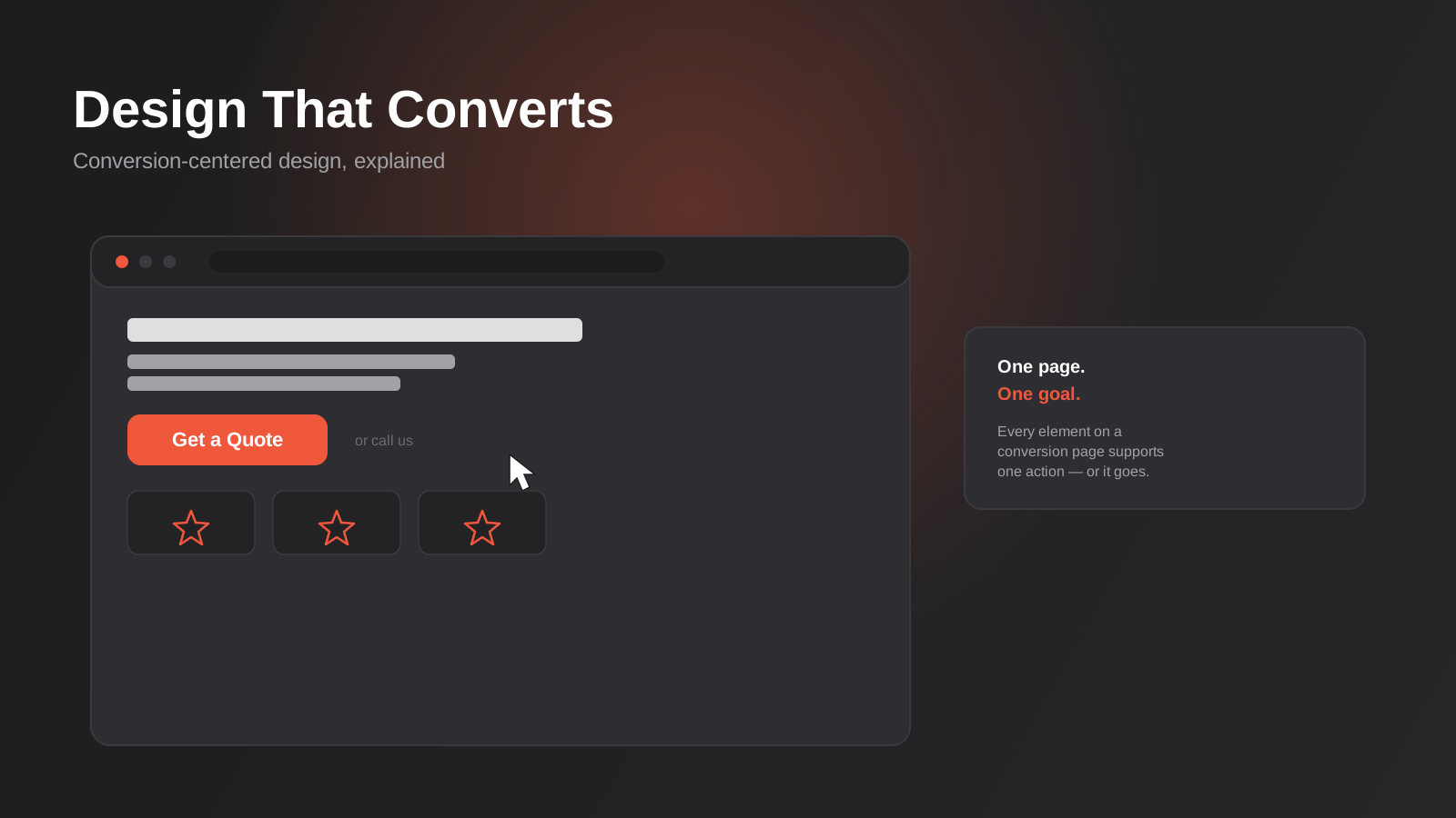
A website can look brilliant and still lose money every day it’s live. We’ve opened enough new client analytics accounts to recognise the pattern: a sharp homepage, a hero video that took three weeks to shoot, typography a design award would notice — and a conversion rate nobody in the business has looked at properly in over a year. The site isn’t broken. It just wasn’t built to do the one thing it needed to do.
That’s the gap conversion-centered design closes. It’s not a rebrand, and it’s not the same thing as the broader UX and usability work we cover in our guide to UX/UI design principles that convert. Conversion-centered design is narrower and more deliberate: every layout decision, every piece of copy placement, every button exists to move one specific visitor toward one specific action. It borrows from psychology as much as from visual design, and it treats a webpage less like a brochure and more like an argument.
This guide walks through what the framework actually involves, where Australian businesses get it wrong, and how to apply it without turning your site into a wall of arrows pointing at a single button. We’ll also cover where it overlaps with testing and data work — covered in more depth in our ecommerce CRO guide — and where it stays a design discipline in its own right.
What Conversion-Centered Design Actually Is (and Isn’t)
The term comes from conversion rate expert Oli Gardner, who coined it to describe a specific design discipline that sits between visual design and behavioural psychology. The core idea is simple to state and genuinely hard to practise: a page built around conversion has exactly one goal, and every element on it either supports that goal or gets removed.
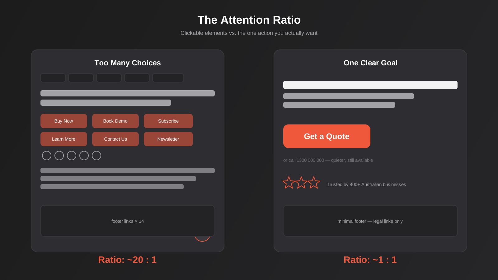
That sounds obvious until you look at most Australian small business websites, where a single landing page carries a main menu, a secondary menu, three different contact methods, a newsletter signup, social media icons, a chat widget, and somewhere down near the bottom, the actual offer. Every one of those elements is a competing exit. Conversion-centered design starts by asking what single action this page exists for, then working backwards from there.
How This Differs From General UX Design
UX design, in the broad sense we cover in our piece on UX/UI principles that convert, is concerned with the whole experience a user has across a product or site — findability, accessibility, consistency, how easy the thing is to learn and use. It’s necessary groundwork and it applies everywhere, including to pages that aren’t trying to convert anyone to anything (a help centre article, for instance).
Conversion-centered design is a subset that applies specifically to pages carrying commercial intent — landing pages, product pages, pricing pages, signup forms, checkout flows. It borrows UX principles but adds a layer of persuasion architecture on top: attention ratios, directional cues, friction audits, and trust placement that general usability guidelines don’t usually prescribe. A page can be perfectly usable and still convert badly, because usability tells you a visitor can complete the action, not that they’re motivated to.
How This Differs From CRO and Testing
Conversion rate optimisation, which we cover in detail in our ecommerce CRO guide, is the measurement and testing discipline that sits downstream of design. CRO asks: did this change actually work, and how do we know? It relies on analytics, heatmaps, session recordings and statistically valid A/B tests to validate or kill a hypothesis.
Conversion-centered design is what you do before you have enough traffic to test anything, or what informs the first version you put in front of a testing tool. You don’t need thousands of monthly visitors to apply attention ratios and reduce form friction — you need them to build a page that isn’t fighting itself from day one. Testing then tells you whether your design instincts were right. The two disciplines work together, but confusing them leads to a common failure mode: businesses either skip design discipline entirely and just start A/B testing random button colours, or they design beautifully and never validate any of it against real behaviour.
The Core Principles
Gardner’s original framework names seven principles. In practice, working with Australian clients across service businesses, ecommerce stores and B2B software, five of them do most of the heavy lifting. We’ll walk through each with the specific decisions they translate into.
One Page, One Goal: The Attention Ratio
Attention ratio is the number of things a visitor can click on a page versus the number of things you actually want them to click. A typical homepage might have an attention ratio of 20:1 or worse once you count every nav item, footer link and social icon. A well-built landing page built for a single campaign should sit as close to 1:1 as the page genuinely allows — one primary call to action, with secondary links (like a phone number for people who’d rather talk) kept visually quieter.
This doesn’t mean stripping navigation from your whole website — that would hurt a homepage or a core service page, which need to support browsing. It means being deliberate about which pages are built for exploration and which are built for conversion, and not applying the same template to both. A paid traffic landing page for a single offer almost never needs a full site header.
Visual Hierarchy and Directional Cues
Eyes move in predictable patterns — roughly an F-pattern on text-heavy pages, a Z-pattern on simpler ones with a clear start and end point. Visual hierarchy means using size, weight, colour and whitespace so the most important things get seen first, not last. On a page that’s badly hierarchised, the headline, the value proposition and the CTA are all competing for the same visual weight, so the eye doesn’t know where to land.
Directional cues go a step further: arrows, pointing imagery, a person’s gaze in a photo, or simply the visual weight of a button pulling attention toward it. These sound like small tricks, but it’s measurable — eye-tracking studies going back over a decade show that a photo of a person looking directly at the camera draws attention to the face, while the same photo with the subject looking toward the CTA pulls the viewer’s eye along with it.
Friction Reduction
Friction is anything that adds effort, confusion or delay between a visitor deciding they want something and actually getting it. Every form field beyond what’s strictly necessary is friction. Every extra click before someone sees a price is friction. An auto-playing video with sound is friction, even if it looks impressive in a pitch deck.
The practical exercise we run with clients is a friction audit: walk through your own conversion path as a first-time visitor who knows nothing about your business, on a phone, on a slow connection, and count every point where you hesitate or have to think. Each one is a candidate for removal, simplification, or at minimum, justification — some friction is there on purpose (qualifying a lead with a few extra questions can be worth the drop-off if it improves lead quality), but it should be a deliberate trade-off, not an accident of how the form was originally built.
Trust Signals, Placed Where the Decision Happens
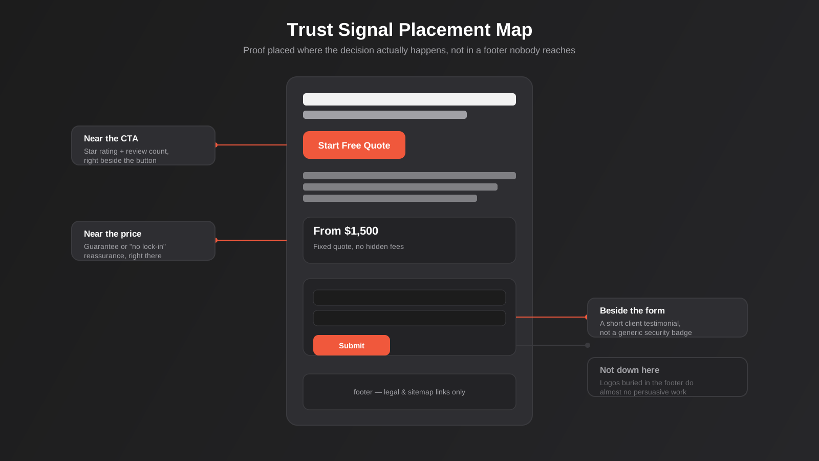
Testimonials, reviews, security badges, client logos and guarantees all do real work, but only if they show up at the moment someone is actually deciding, not buried in a separate “About Us” page three clicks away. A trust signal placed above a form, right where someone is about to hand over their email or phone number, does more than the same signal sitting in a footer nobody scrolls to.
This is one of the most commonly skipped principles because trust signals feel like “content” rather than “design,” so they get added wherever there’s leftover space rather than placed with intent. Map out where your visitor is actually hesitating — usually right before a form submit, a checkout button, or a phone call — and put the relevant proof there specifically.
Clarity Over Cleverness
The last principle worth calling out on its own: a confused visitor doesn’t convert. Clever headlines, industry jargon, and vague value propositions that sound good in a boardroom (“Empowering tomorrow’s solutions, today”) consistently underperform plain language that says exactly what the business does and why it matters to the person reading it. If a visitor has to work to understand your offer, you’ve already lost a share of them before they even reach the CTA.
The Psychology Behind Why This Works
None of the principles above are design tricks invented by agencies to sound clever in a pitch. They’re downstream of fairly well-established behavioural psychology, and understanding the mechanism makes it much easier to apply the principle correctly rather than by rote.
Cognitive Load and Hick’s Law
Hick’s Law, which the Nielsen Norman Group has written about at length in the context of interface and interaction design, describes something most of us have felt without naming it: the time it takes someone to make a decision increases with the number and complexity of choices in front of them. A page with twelve navigation items, four different offers and three ways to get in touch doesn’t just look busy — it measurably slows down the one decision you actually want the visitor to make. Every option you remove from a conversion-critical page isn’t just visual tidying; it’s shortening the actual decision-making process happening in someone’s head before they’ve even noticed they’re making it.
This is also why “just add another option in case some visitors want it” is almost always the wrong instinct on a landing page, even though it feels like you’re being helpful. A second or third call to action doesn’t capture the visitors who would have ignored the first one — it dilutes the attention the primary action was getting from everyone else.
Social Proof and Loss Aversion
Trust signals work because of social proof — people use the behaviour of others as a shortcut for deciding whether something is safe or worthwhile, especially when they can’t evaluate the decision fully themselves (which describes most purchases of a service they haven’t used before). A specific number (“Trusted by 400+ Australian businesses”) does more work than a vague claim (“Trusted by businesses across Australia”) because specificity reads as more credible, even though both might be true.
Loss aversion — the tendency to weigh the pain of losing something more heavily than the pleasure of gaining the equivalent — is why guarantees, limited availability framed honestly, and “don’t lose your spot” messaging around genuine scarcity (not invented urgency) tend to outperform purely positive framing. The line between using this honestly and using it as a dark pattern is thin, and we’d rather a client err toward honesty; manufactured countdown timers that reset on refresh erode the exact trust the rest of the page is trying to build.
Decision Fatigue and Why Simpler Forms Convert
Decision fatigue is the reason a ten-field form converts worse than a two-field form even when the extra fields take seconds each to fill in. Every field is a small decision, and small decisions accumulate real mental cost across a session, particularly on mobile where typing itself is more effortful. This is also why the order of fields matters — asking for an easy, low-commitment piece of information first (a first name) before a higher-commitment one (a credit card or detailed project brief) keeps momentum going, because people who have already started a process are measurably more likely to finish it than people deciding whether to start at all.
Applying the Framework to Different Page Types
The principles above apply differently depending on what kind of page you’re designing. Treating a homepage like a landing page, or a checkout flow like a blog post, is where a lot of otherwise sound design advice goes wrong in practice.
Homepages
A homepage genuinely needs to serve multiple audiences — new visitors trying to work out what you do, returning customers looking for support, job seekers, and sometimes journalists or investors. A strict 1:1 attention ratio doesn’t make sense here. What still applies is hierarchy: your primary audience and primary action (usually a specific service enquiry, not a generic “Contact Us”) should dominate visually, with secondary paths available but clearly secondary.
Landing Pages
This is where conversion-centered design applies most strictly. A landing page built for a specific Google Ads or Meta campaign should match the promise of the ad exactly, strip the main site navigation, and carry a single call to action repeated at logical points down the page rather than scattered CTAs pointing at different things. We go into the build side of this in our guide to landing page development, including why a landing page built on your main site template usually underperforms a dedicated one built for the campaign.
Product and Service Pages
These pages carry more information load than a landing page — specs, pricing tiers, FAQs — so a strict single-goal approach isn’t realistic. The fix is progressive disclosure: lead with the core value proposition and primary CTA above the fold, then layer in supporting detail (specifications, comparisons, social proof) as the visitor scrolls and their questions naturally arise, rather than front-loading everything at once.
Pricing Pages
Pricing pages carry a particular kind of friction: uncertainty. A visitor who’s reached your pricing page is usually close to converting, but they’re also actively comparing you against alternatives, so clarity matters more here than almost anywhere else on the site. Burying your actual numbers behind a “request a quote” form when competitors show theirs upfront tends to cost you comparison shoppers who’ll simply move to the next open tab. Where a fixed price genuinely isn’t possible because every project is scoped individually, say so plainly and explain why, rather than leaving the page vague and hoping nobody notices.
Tiered pricing tables benefit from the same hierarchy principles covered earlier — one tier (usually the middle one) should be visually emphasised as the recommended option, because an unranked list of equal-weight choices reintroduces exactly the decision fatigue problem a pricing page is meant to resolve, not create.
Forms and Checkout
Forms and checkout flows are the purest test of friction reduction because every field has a measurable cost. Ask only for what you need at each stage — a lot of businesses ask for a phone number, company size and budget range on a first contact form when an email address alone would get the conversation started. Multi-step forms that show progress typically outperform long single-page forms for anything beyond four or five fields, because they break a large decision into smaller, less intimidating ones.
How to Run a Lightweight Conversion Audit Yourself
You don’t need specialised software or a large budget to find the obvious problems on a page. Before commissioning a full redesign, this is the same rough sequence we’d run through ourselves on a first pass, and most businesses can do the first three steps in under an hour.
Step 1: Count the Exits
Open your highest-traffic conversion page and literally count every clickable element — nav items, footer links, social icons, secondary CTAs, chat widgets. Compare that number against how many actions you actually want a visitor to take. If the ratio is wildly lopsided, that’s your attention ratio problem, and it’s usually the single highest-leverage fix available because it costs nothing to implement — it’s subtraction, not new design work.
Step 2: Trace the Decision Points
Walk through the page as a first-time visitor and mark every point where you’d naturally pause: right before clicking a CTA, right before submitting a form, right before entering payment details. At each of those points, ask whether there’s a relevant piece of trust or reassurance visible without scrolling away from the decision. If the nearest testimonial or guarantee is three scrolls away, it isn’t doing any work at the moment it’s actually needed.
Step 3: Test It on an Actual Phone, Not a Resized Browser Window
A desktop browser resized to mobile width hides problems that only show up on a real device — sluggish tap targets, keyboard types that don’t match the field, a sticky header that eats a third of the screen. Do this on your own phone, on mobile data rather than office wifi, and note anywhere you have to pinch, zoom, or re-tap.
Step 4: Read Your Own Copy Out Loud
This sounds unrelated to design, but copy and design are inseparable in conversion-centered work — a perfectly hierarchised page with a confusing headline still fails. If you stumble reading your own value proposition aloud, or it takes more than a sentence to say what you actually do, a visitor skimming the page in four seconds has no chance.
Step 5: Check Whether Your Analytics Can Even Answer the Question
Before assuming a page is underperforming, confirm your conversion tracking is actually set up correctly — it’s a surprisingly common finding that a page assumed to be “converting badly” simply isn’t being measured at all, or is double-counting form submissions. A free audit like this is also exactly the kind of starting point our conversion-focused design team runs before touching a single pixel, just with heatmap and session-recording data layered on top of what you can see by eye.
Mobile-First Conversion Design
For most Australian businesses, mobile traffic now makes up the majority of sessions, and conversion-centered design that only works on a 15-inch monitor is design that’s failing most of your actual audience. Mobile changes several of the principles above in practical ways.
Thumb zones matter more than mouse cursors: primary CTAs should sit within easy reach of a thumb on a one-handed grip, not tucked into a top corner that requires a stretch or a second hand. Forms need native input types — a phone number field should trigger the numeric keypad, a date field should trigger a native date picker — because forcing someone to type a date manually on a phone keyboard is friction you added for no reason. Touch targets need genuine size, not just visual size; a button that looks tappable but has a cramped actual hit area creates frustrating mis-taps that cost you visitors who assume the site is broken.
Sticky elements deserve a specific mention: a CTA bar that stays visible as someone scrolls through a long product or service page removes the friction of scrolling back up to convert, and on mobile specifically it’s one of the highest-leverage, lowest-effort changes available. The trade-off is that it needs to be unobtrusive enough not to cover content or feel like a popup ambush.
Design Systems and Consistency at Scale
Conversion-centered design principles are straightforward to apply to a single landing page. They get harder to maintain once a business has fifty pages, three people touching the website, and a backlog of “quick fixes” that have quietly eroded the original hierarchy over eighteen months. This is where a proper design system earns its cost — a documented set of components, spacing rules and CTA patterns means every new page built inherits the same attention-ratio discipline and trust-signal placement by default, rather than each new page reinventing the layout from scratch and gradually drifting away from what actually converts.
Without that structure, the most common failure we see isn’t a single bad page — it’s conversion-centered thinking applied once, on one hero landing page, and then abandoned everywhere else the business builds a new page afterward.
Common Mistakes
- Treating every page on the site like it needs to convert at the same intensity as a dedicated landing page, which makes informational and support pages feel pushy and erodes trust rather than building it.
- Adding trust signals as decoration in a footer instead of placing them at the specific point a visitor is hesitating — right before a form, a price, or a checkout button.
- Copying a competitor’s layout without understanding why it works for their audience, their offer and their traffic source, which rarely transfers cleanly to a different business.
- Designing a beautiful desktop experience first and treating the mobile version as an afterthought, when mobile is where most of the actual traffic lands.
- Running a full visual redesign based on internal opinion or a trend, then wondering why conversion didn’t improve, because the change wasn’t tied to any specific behavioural problem in the first place.
- Adding friction deliberately through long qualifying forms without first checking whether the lead-quality trade-off is actually worth the drop-off it causes.
- Scattering multiple competing calls to action on one page — “Buy Now,” “Learn More,” “Book a Demo,” and “Subscribe” all on the same screen — which forces the visitor to do the prioritising work the page should have done for them.
Frequently Asked Questions
Is conversion-centered design the same as conversion rate optimisation?
No. Conversion-centered design is a design framework applied before or independently of testing — it’s about structuring a page around a single goal using proven principles like attention ratio and trust placement. CRO is the measurement discipline that validates design decisions through analytics and A/B testing. You can apply conversion-centered design without ever running a formal test, though testing tells you whether your design choices actually worked for your specific audience.
Does a low-traffic website still benefit from this approach?
Yes, more than most businesses expect. Formal A/B testing needs volume to reach statistical significance, but the design principles themselves don’t require any traffic at all to apply. A small trades business getting forty visitors a week still loses real enquiries to a confusing form or a buried phone number — fixing that doesn’t need a testing tool, just a deliberate look at the page with fresh eyes.
Will a conversion-focused redesign hurt my brand or make the site feel pushy?
It shouldn’t, if it’s done properly. Conversion-centered design is about clarity and reduced friction, not aggressive sales tactics — a page with one clear goal and well-placed trust signals generally feels calmer and more professional than one cluttered with competing offers and popups. The brands that feel pushy are usually the ones leaning on dark patterns and urgency gimmicks, which is a different and separate problem from good conversion design.
How many pages on my site actually need this treatment?
Start with the pages that carry the most commercial weight and the most traffic: your main service or product pages, any paid traffic landing pages, and your contact or quote-request form. Informational pages like blog posts, FAQs and your About page don’t need a strict single-goal treatment — applying the same intensity everywhere is one of the common mistakes above.
What’s the fastest way to audit my current site against these principles?
Pick your highest-traffic conversion page and count every clickable element — that’s your attention ratio. Then walk the page on a phone as a first-time visitor and note every point you hesitate, re-read something, or have to scroll back to check a detail. Those two exercises alone surface most of the obvious problems before you need any specialised tooling.
Should I redesign the whole site at once or fix pages one at a time?
One at a time, starting with whichever page carries the most traffic or revenue risk. A full-site redesign driven by these principles is a bigger, riskier project, and it makes it much harder to tell which specific change actually moved the numbers. Fixing your highest-impact page first also gives you a template and a proof point to apply to the rest of the site with more confidence.
Where to Start
If you’re looking at a page right now and suspect it’s working against itself — too many competing links, a form that asks too much too soon, trust signals nobody will ever scroll down to see — that’s usually enough of a starting signal on its own. You don’t need a full audit before making a start; you need to pick the one page carrying the most traffic or the most revenue risk and apply the principles above to it first.
Our conversion-focused design service is built around exactly this: we look at how visitors actually behave on your current pages, then redesign with that data as the brief rather than a guess. If the problem is closer to the ground up — you’re building new pages rather than fixing existing ones — our UX & UI design work covers that research-led process instead.
On cost: because we run lean as a specialist agency rather than carrying a large account-management layer, our fixed quotes typically come in below the Australian averages covered in this guide. If you’ve already got a written quote from another agency for comparable scope, send it through and we’ll do our best to beat it.
Keep reading
Related posts
When to Rebrand Your Business: Signs, Process and Real Cost in Australia (2026)
Real signs it's time to rebrand, what the process actually involves, and honest 2026 Australian cost ranges for getting it right.
Dark Patterns in Website Design: What Australia’s Unfair Trading Practices Law Means for Your Site
Dark patterns in website design explained: what counts, how Australia’s incoming unfair trading practices law applies, and what to build instead.
Graphic Design for Australian Businesses: What You Actually Need (and When Canva Stops Being Enough)
What graphic design actually covers for Australian businesses, real 2026 pricing, and a practical framework for when DIY tools stop being enough.
Got a project you'd like to talk through?
Tell us what you're working on — we'll come back with a plan.
