
Ecommerce CRO: How Australian Online Stores Turn More Browsers Into Buyers (2026)
 Jignesh Vagadiya
13/09/2026
21 min read
Jignesh Vagadiya
13/09/2026
21 min read
Most Australian online stores are sitting on a conversion problem they’ve never actually measured. They know their traffic numbers. They know roughly what they spend on ads. What they don’t know, because nobody’s ever pulled the numbers apart, is what percentage of visitors who land on a product page actually finish a purchase — and where, specifically, the rest of them give up.
That gap matters more than almost anything else in ecommerce. A store converting at 1% and a near-identical store converting at 3% aren’t three times different in traffic or budget — they’re three times different in how well the site does its actual job. Fixing that gap is usually cheaper than buying more traffic, and it compounds: every channel you run, from Google Ads to social media to organic search, gets more efficient the moment the site converts better.
This is a practical breakdown of ecommerce conversion rate optimisation specifically — not CRO in general, which we’ve covered in our complete guide to conversion rate optimisation. That piece covers CRO as a discipline: research methods, testing statistics, prioritisation frameworks. This one narrows in on the parts that are unique to running a store — product pages, cart behaviour, checkout flow, shipping costs and the Australian-specific quirks that quietly cost stores sales every day.
What a “good” ecommerce conversion rate actually looks like
Before touching anything on the site, it’s worth knowing what you’re actually being compared against, because the number that gets thrown around most — “average ecommerce conversion rate is around 2 to 3%” — hides more than it reveals.
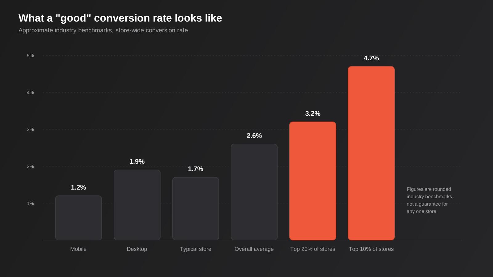
Store-wide, most published benchmark studies put the global average somewhere between 2.5% and 3%, with the typical Shopify store converting noticeably lower, often in the 1.4% to 1.8% range. That gap between “ecommerce overall” and “typical Shopify store” exists because the overall figure includes a lot of larger, more established retailers with years of optimisation behind them, while the median new store is still working out its offer, its imagery and its trust signals.
Benchmarks vary enormously by device and category
Desktop conversion rates consistently sit well above mobile — commonly around 1.9% on desktop against roughly 1.2% on mobile, even though mobile now accounts for the majority of ecommerce sessions for most Australian stores. That’s not because mobile shoppers are less interested; it’s because mobile checkout flows are more often the weak point, and small friction that a desktop user barely notices becomes a genuine barrier on a five-inch screen with patchy reception.
Category matters too. Food and beverage, pet products and health and beauty tend to convert well above the general average because they’re repeat-purchase categories with lower consideration cost. Fashion, furniture and higher-ticket categories convert lower because the purchase decision takes longer and involves more research, more tabs open, more “I’ll come back to this” behaviour.
The practical takeaway: don’t benchmark your store against a single generic number. Benchmark against your own category and device split, track the trend over time, and treat “top 20% of stores convert above roughly 3.2%, top 10% above 4.7%” as the more useful target than the flat average.
Where the funnel actually breaks
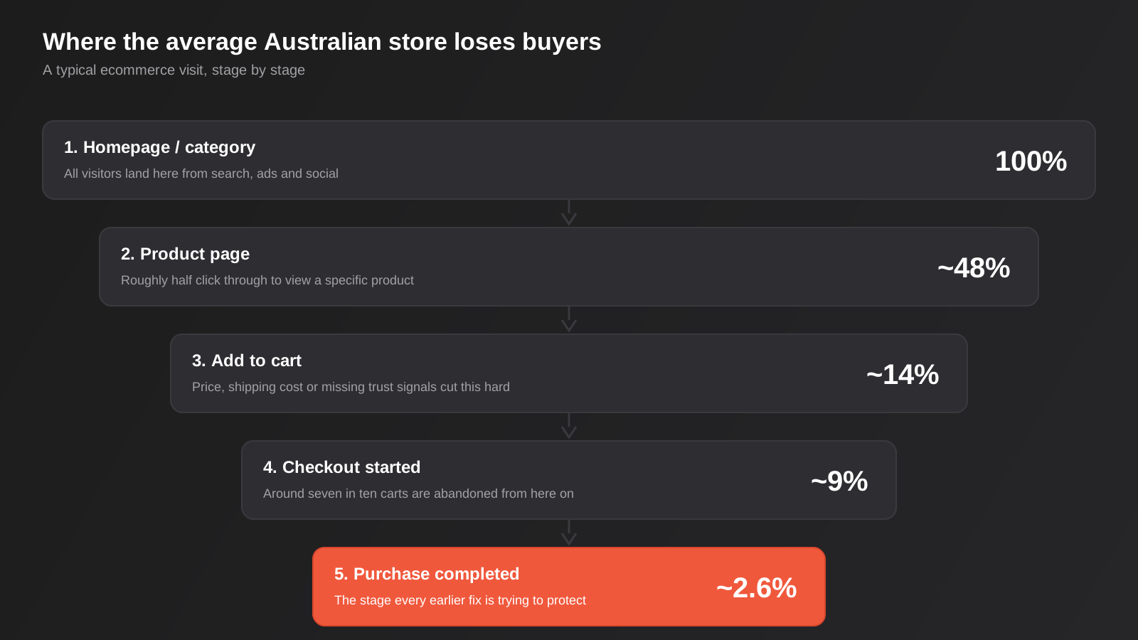
If you map a typical ecommerce session from landing to purchase, the drop-off isn’t evenly spread. It’s concentrated at a few specific points, and each point has a different cause and a different fix.
Homepage and category pages: the filtering stage
This is where visitors decide whether your store is worth spending more time on. The biggest cost here isn’t usually design — it’s findability. If someone lands looking for a specific product and your navigation, search or filtering makes them work to find it, they leave before they ever see anything worth converting on. Site search that handles typos and synonyms, category pages that load fast and filter properly by size, price and attribute, and clear signals about stock and delivery timeframes all sit at this stage.
Product pages: the persuasion stage
Roughly half of homepage visitors will click through to a product page, and this is where the real work of CRO happens, because a product page has to do a lot in a short window: answer “is this the right one,” “can I trust this store,” and “what happens if I don’t like it” all before the visitor has scrolled past the fold on mobile.
Cart: the commitment stage
Adding to cart is a soft commitment, not a real one — plenty of visitors add to cart purely to check the total cost including shipping, then leave. This is the stage where price transparency and shipping cost disclosure matter more than almost anything else on the page.
Checkout: the friction stage
This is where cart abandonment gets its reputation. Published research consistently puts average cart abandonment somewhere around 70%, and mobile abandonment runs even higher, commonly quoted in the 73% to 75% range, climbing well past that on poorly optimised mobile checkouts. Every unnecessary field, every forced account creation, every surprise cost at this stage is a visitor who was ready to buy and didn’t.
Category pages and site search deserve their own audit
Product pages get most of the attention in CRO conversations, but a meaningful share of visitors never make it that far in a useful way, because the category page or the site search let them down first. This stage is easy to overlook because nothing about it looks broken — the page loads, the products show up — but “technically working” and “actually helping someone find what they want” aren’t the same thing.
Filtering that matches how customers actually think
Filters built around your internal product taxonomy rather than how a customer searches are a common source of quiet drop-off. If someone shopping for shoes wants to filter by size and colour and your filter sidebar only offers brand and material, they’ll leave rather than scroll through forty products manually. The fix is usually not more filters, it’s the right filters for the category — the two or three attributes that actually drive the decision for that specific product type.
Site search has to tolerate mistakes
A visitor who searches “jumper” on a store that only lists “jumpers” as “knitwear,” or who makes a small typo and gets a blank results page, has just been told your store doesn’t have what they want — even when it does. Search that handles plurals, common misspellings and synonyms, plus a “no exact matches, here’s what’s close” fallback instead of a dead end, recovers visitors who were often close to a genuine purchase decision. For stores on Shopify or WooCommerce this is frequently a plugin-level upgrade rather than custom development, and it’s one of the higher-leverage, lower-effort fixes on this entire list.
Sort order and default view matter more than they seem to
Default sort order shapes what gets seen first, and “featured” or “newest” isn’t always the right default for every category. For categories where price sensitivity is high, a “best selling” or “most reviewed” default surfaces social proof automatically, before the visitor has to dig for it. Small change, genuinely measurable effect on category-to-product click-through.
Fixing the product page
Product page work tends to get the most attention in ecommerce CRO, and for good reason — it’s the stage with the most controllable variables and the clearest link between a specific change and a measurable outcome.
Reviews and social proof aren’t optional anymore
Reviews are consistently the single most influential trust signal on a product page. The vast majority of online shoppers check reviews before buying, and studies looking specifically at higher-priced items have found review presence lifting conversion dramatically compared to pages with none at all. What matters isn’t just having reviews — it’s how they’re presented. A specific review count (“1,247 reviews”) reads as more credible than a star rating alone, and real customer photos in the product gallery consistently outperform studio shots alone, because they answer the unspoken question “does this actually look like the photos in real life.”
If you’re running Shopify or WooCommerce, this is usually a plugin-level fix rather than a rebuild — the harder part is actually getting customers to leave reviews in the first place, which is where a well-timed post-purchase email sits (more on that shortly).
Answer the objection before it’s raised
Every product has a handful of predictable hesitations — sizing, durability, “will this actually work for my situation,” return policy, delivery time. Good product copy answers these directly rather than leaving the visitor to search for the answer or, more likely, leave and compare with a competitor who answered it clearly. Return policy placement matters more than most stores realise: putting a clear, simple return policy near the add-to-cart button rather than buried in a footer link consistently improves add-to-cart rates, because it removes the “what if I don’t like it” hesitation at the exact moment it appears.
Security and payment trust signals
A meaningful share of shoppers still cite fraud concern and payment security as a reason for not completing a purchase on an unfamiliar store, particularly for first-time visitors without brand recognition. Trust badges, recognisable payment logos (Afterpay, PayPal, Apple Pay carry real weight in Australia specifically) and a visible secure checkout indicator aren’t decoration — they’re addressing a genuine, common hesitation.
Fixing cart and checkout
This is the highest-leverage part of ecommerce CRO because the visitor has already decided to buy. Every fix here is about removing reasons to stop, not persuading someone who wasn’t going to purchase anyway.
Shipping cost transparency is an Australian-specific problem
Unexpected shipping costs at checkout are consistently cited as the single biggest cause of cart abandonment across most research on the topic, and Australian shoppers appear to have a fairly specific tolerance threshold: a meaningful share abandon purchases once shipping costs (particularly from overseas retailers) exceed around $20. If your shipping cost isn’t visible until the final checkout step, you’re relying on the visitor tolerating a surprise they may well not tolerate. Showing an estimated shipping cost on the product page or cart page, or offering a free-shipping threshold with a visible progress indicator (“add $18 more for free shipping”), both work because they remove the surprise entirely.
Guest checkout and express payment
Forcing account creation before checkout is one of the most reliable ways to lose a ready buyer. Guest checkout should always be the default, with account creation offered as an optional step after the order is placed, not before. Express payment options — Apple Pay, Google Pay, Shop Pay, Afterpay — reduce the number of fields a mobile visitor has to fill in on a small screen, and stores offering one-page or express checkout flows consistently see meaningfully better conversion than those running a traditional multi-step form.
Reduce fields, reduce steps, show progress
Every additional form field is a small tax on completion. Address autocomplete, saved payment methods for returning customers, and a visible progress indicator on multi-step checkouts (so the visitor knows they’re two steps from done, not wondering how much further it goes) all reduce the psychological cost of finishing.
Mobile checkout deserves its own audit
Given the gap between desktop and mobile conversion rates, it’s worth actually testing your own checkout on a phone, on mobile data, not wifi. Tap targets that are too small, forms that trigger the wrong keyboard type (a numeric keypad should appear for a phone number field, not the full alphabet), and page speed all matter more on mobile than most store owners assume — even small improvements in mobile load time have been shown to lift retail conversion meaningfully, because impatience compounds with connection quality on the go.
Don’t skip the cart page itself
A lot of CRO advice jumps straight from product page to checkout, treating the cart page as a formality in between. It isn’t. The cart page is where a visitor does their final mental maths, and a handful of common problems here quietly undo good work done everywhere else.
A broken or overly prominent promo code field
An empty “have a promo code?” field sitting right above the total does one of two unhelpful things: it either sends price-sensitive visitors off to search for a working code (some of whom don’t come back), or it makes visitors without a code feel like they’re paying more than they should be, even when they aren’t. Collapsing this into a smaller, less prominent link rather than an open text field reduces both problems without removing the feature for people who do have a legitimate code.
Show the shipping estimate here, not three steps later
This is worth repeating at the cart stage specifically because it’s the last point before checkout where you can set expectations. A simple postcode-based shipping estimate, or a clear statement of your flat rate and free-shipping threshold, removes the single most common reason carts get abandoned before checkout even starts.
Cross-sells that help rather than distract
A small “customers also bought” or “complete the set” module on the cart page can lift average order value without hurting conversion, provided it doesn’t compete visually with the actual checkout button. The moment a cross-sell module makes it harder to find “proceed to checkout,” it’s costing more than it’s earning.
Measuring what’s actually happening
None of the fixes above are worth much without a way to see whether they worked. Ecommerce CRO lives or dies on whether you can actually see the funnel, not just the top-line conversion rate.
Set up ecommerce reporting properly, not just goal tracking
GA4’s ecommerce reporting, set up correctly with the full funnel events (view item, add to cart, begin checkout, purchase), is the baseline most stores are missing. A lot of Shopify and WooCommerce stores have analytics installed but never configured beyond pageviews, which means there’s no way to see at which exact step visitors are leaving — only that they eventually didn’t buy. This is foundational enough that it’s worth getting right before investing in anything else on this list.
Session recordings show you the “why” behind the numbers
Funnel reports tell you where people drop off. Session recording tools show you why — the visitor who rage-clicked a non-functional size selector, the one who opened the shipping policy in a new tab and never came back, the one who tried to apply a promo code four times before giving up. Watching a handful of recordings on your highest-traffic product page is often more useful than a week of guessing based on the analytics alone.
Ask the customers who didn’t buy
An exit-intent survey with a single question — “what stopped you from completing your purchase today?” — costs nothing to set up and produces genuinely useful qualitative data that heatmaps can’t. It won’t get a high response rate, but even a small number of specific, honest answers (“shipping was more than I expected,” “wasn’t sure about sizing,” “wanted to compare with another site first”) will usually confirm or correct whatever you assumed the problem was.
Recovering the carts you still lose
Even a well-optimised checkout won’t get everyone to complete on the first visit. Some visitors get distracted, some are price-comparing, some were never going to buy that session regardless of friction. Recovering a share of these doesn’t require reinventing the checkout — it requires catching people close to the point they dropped off.
On-site, exit-intent messaging that offers help (a discount is one option, but a simple “need help deciding? chat with us” or a reassurance about returns can work just as well without training customers to expect a discount every visit) can recover a slice of visitors before they leave entirely.
Off-site, abandoned cart email sequences remain one of the highest-converting automated flows in ecommerce — commonly cited open rates well above 40% and conversion rates in the low double digits on the recovery emails themselves, because you’re messaging someone who already showed clear purchase intent. We’ve written a full breakdown of how to build these sequences properly in our email marketing automation guide, covering timing, sequencing and what actually goes in each email. If your store’s broader operational systems — inventory sync, order processing, fulfilment — are also still manual, that’s a separate but related time sink worth auditing on its own.
Retargeting ads and browser push notifications can supplement email recovery, but they work best as a second layer rather than the primary mechanism — email and SMS reach a customer directly, while retargeting depends on them seeing the right ad at the right moment on a platform they happen to be scrolling. Layer them if the budget allows it; don’t rely on retargeting alone as your only abandoned cart strategy, since it’s the least direct and generally the most expensive of the three.
Running CRO as an actual process, not a redesign
The biggest mistake in ecommerce CRO isn’t picking the wrong fix — it’s treating CRO as a one-off redesign project rather than an ongoing process of small, measured changes. A full site redesign changes dozens of variables at once, which means when conversion goes up (or down), you have no idea which of the forty things you changed actually caused it.
Start with data, not opinion
Before changing anything, look at what’s actually happening: funnel reports showing where visitors drop off by device and traffic source, session recordings on your highest-traffic product pages, and heatmaps showing whether people are even scrolling far enough to see your reviews section. Traffic source matters more than most stores account for — visitors arriving from social media typically show a noticeably higher cart abandonment rate than those arriving from search or direct traffic, because the intent level on arrival is different. A visitor who searched “buy [product] Australia” is closer to purchase than one who clicked an Instagram ad mid-scroll.
Prioritise by impact and effort, not by what’s easiest to build
A simple framework works fine here: score each potential fix on how many visitors it affects, how much friction it likely removes, and how much work it takes to implement. Adding review counts to product cards on category pages might affect every visitor and take an afternoon. Rebuilding the entire checkout flow might have a bigger theoretical ceiling but take months and carry real risk of breaking something that currently works. Do the high-impact, low-effort fixes first — they fund the confidence and the internal buy-in to tackle the bigger ones.
Test properly, or don’t call it a test
Smaller Australian stores often don’t have the traffic volume to run a statistically valid A/B test on a single page change within a reasonable timeframe, and that’s fine to admit — it doesn’t mean CRO is pointless, it means the method has to adapt. For lower-traffic stores, sequential before/after testing over a matched time period (comparing against the same weeks last year, accounting for seasonality), combined with qualitative signals like session recordings and direct customer feedback, is often more reliable than forcing an underpowered split test that will never reach significance. Save formal A/B testing for genuinely high-traffic pages where you can reach a real sample size within weeks, not months.
Common mistakes we see on Australian ecommerce sites
- Hiding shipping cost until the final checkout step instead of showing it on the product or cart page, which turns a manageable expectation into a last-minute surprise
- Forcing account creation before checkout can even begin, which loses ready buyers who simply want to complete a purchase without the extra step
- Running a full site redesign as the “CRO project” instead of testing individual changes, which makes it impossible to know afterwards what actually moved the number
- Treating mobile as a smaller version of desktop rather than auditing it as its own experience on an actual phone, on mobile data
- Launching a discount pop-up on every single visit instead of restricting it to exit intent or first-time visitors, which trains repeat customers to wait for a deal
- Collecting reviews but never actually surfacing the count or the best ones on category pages, where they’d influence the click-through decision earliest
- Ignoring traffic source when reviewing conversion data, and drawing conclusions from a blended average that hides where the real problem actually sits
- Chasing a “best practice” checklist copied from a competitor without checking whether it fits their own product, price point and customer base
- Leaving site search unable to handle a typo, a plural, or a synonym, and losing visitors who typed the wrong word for something you actually stock
Frequently Asked Questions
What’s a realistic conversion rate to aim for as a new Australian store?
New stores commonly convert at 1% or below in the first six to twelve months while they’re still building trust signals, traffic quality and a review base. That’s normal, not a failure. The more useful goal early on is steady month-on-month improvement rather than hitting an arbitrary “industry average” figure that assumes years of accumulated trust you haven’t built yet.
Should I focus on getting more traffic or improving conversion rate first?
If your conversion rate is well below your category benchmark, fix that first — every dollar you then spend on traffic works harder immediately, without waiting for a new campaign to ramp up. If your conversion rate is already solid for your category and device mix, more qualified traffic is the better lever. Most stores we look at have more room in conversion than they assume, simply because nobody’s audited the funnel stage by stage.
Does adding a discount pop-up actually help conversion rate?
It can help short-term, but it trains repeat visitors to wait for a discount rather than buy at full price, which erodes margin over time. It works best restricted to genuine exit intent, or to first-time visitors only, rather than showing on every single visit regardless of intent or purchase history.
How long does an ecommerce CRO project usually take to show results?
Individual fixes like adding trust signals or fixing a checkout field can show a difference within a few weeks of enough traffic passing through. Bigger structural changes, and building the sample size for confident before/after comparison, are more realistic over a two to three month window, particularly for stores without huge daily traffic volume.
Is CRO worth it for a small store with limited traffic?
Yes, arguably more so than for a high-traffic store, because every visitor matters more when there are fewer of them. The method has to change — formal split testing needs volume a small store often doesn’t have — but sequential testing, funnel analysis and fixing obvious friction points (shipping transparency, guest checkout, reviews) apply regardless of traffic size and tend to have an outsized effect on smaller stores precisely because so few have done this work at all.
Do I need a full redesign to improve conversion rate, or can I fix the existing site?
Almost always the existing site, at least first. A redesign changes everything at once, makes it impossible to know what actually worked, and carries real risk of accidentally removing something that was quietly converting well. Start with the funnel audit, fix the highest-impact friction points on the current site, and only consider a rebuild if the platform itself is genuinely holding you back — slow, unable to support the checkout flow you need, or too limited for the catalogue size you’re running.
Where to start
If you haven’t already, the first step is genuinely simple: pull up your analytics and map your own funnel — homepage or category page through to product view, add to cart, checkout start, and purchase — by device. That single view will usually tell you more about where you’re actually losing sales than any generic best-practice checklist, including this one.
From there, the fixes tend to fall into a fairly short list: shipping transparency, checkout friction, product page trust signals, and mobile-specific issues. Some of that is a few hours of work. Some of it, particularly if your platform is genuinely limiting what you can do at checkout, is a bigger conversation about the store itself — whether that’s a design refresh built around conversion or a look at whether your current platform gives you enough room to move.
If you’d rather have someone pull that funnel report apart with you and tell you honestly where the real opportunity is before you spend on anything, our CRO team is happy to have that conversation — no pressure, just a genuine look at the numbers.
Keep reading
Related posts
Best Analytics and Reporting Tools After GA4 for Australian Businesses (2026): 6 Compared
Six analytics and reporting tools to use alongside or instead of GA4, compared for Australian businesses on cost, privacy, data location and…
Google Analytics 4 Setup: A Practical Configuration Guide for Australian Businesses (2026)
A practical GA4 setup guide for Australian businesses: events, key events, filters and the mistakes that quietly corrupt your data.
A/B Testing for Australian Websites: How to Run Tests That Actually Tell You Something (2026)
How to run A/B tests that hold up: sample size, avoiding peeking, low-traffic alternatives and building a real testing programme in Australia.
Got a project you'd like to talk through?
Tell us what you're working on — we'll come back with a plan.
