
Brand Identity vs Visual Identity: What Australian Businesses Actually Need
 Jignesh Vagadiya
04/09/2026
21 min read
A client came to us with a good-looking logo, a Pantone-matched colour palette and absolutely no idea why their website, their invoices and their Instagram page all felt like three different companies. That is the single most common branding problem we see, and it is not really a design problem. It is a sequencing problem. Somebody bought a logo and called it a brand.
Brand identity and visual identity get used interchangeably so often that most business owners treat “brand identity vs visual identity” as a distinction only designers care about. They are not the same thing, and the gap between them is exactly where inconsistent, forgettable brands come from. Visual identity is what people see: the logo, the colours, the type, the imagery. Brand identity is everything underneath that, the positioning, the values, the personality and the promise that the visuals are supposed to represent. Get the order backwards, start with a logo before you have decided what the business actually stands for, and you end up with visuals that look fine in isolation but say nothing consistent once they hit a website, a proposal, a van sign and a LinkedIn post.
This guide sets out what brand identity and visual identity actually mean, what a working visual identity system needs to include, when a business genuinely needs documented brand guidelines versus when that is overkill, and how to tell a refresh from a full rebrand before you spend money on either. We work on this daily as part of our branding and visual identity service, so this is the version of the conversation we’d have with you before quoting anything.
Brand Identity vs Visual Identity: What’s Actually the Difference
Brand identity is the complete package: who you are, what you stand for, who you’re for, and how you want to be perceived. It covers your positioning against competitors, your values, your personality (are you the friendly local expert or the no-nonsense specialist?), your tone of voice, and your core messaging. None of that is visual. You could write a brand identity document without ever mentioning a colour or a font.
Visual identity is the subset of brand identity that you can actually see. It’s the logo, the colour palette, the typography, the photography or illustration style, the iconography, and the layout conventions that show up across your website, packaging, signage and social channels. Visual identity is how the brand gets translated into something a customer can recognise in half a second, scrolling past on a phone screen.
Here’s the practical test we use with clients: if you can describe your visual identity (colours, fonts, logo style) but can’t answer “who is this business for and what makes it different from the three competitors down the road”, you have a visual identity without a brand identity underneath it. That’s fixable, but it usually means going backwards to do the strategy work you skipped, rather than tweaking the logo again.
The reverse problem is less common but just as damaging: businesses with a genuinely clear sense of who they are and why customers should choose them, expressed through a visual identity that doesn’t match. A construction company with strong local relationships and a reputation for straightforward pricing, using a visual identity that looks like a fintech startup, is sending mixed signals before a prospect reads a word of copy.
The Three Layers of a Working Brand System
It helps to think of a brand as three layers stacked on top of each other. Skip a layer and the ones above it have nothing solid to stand on.
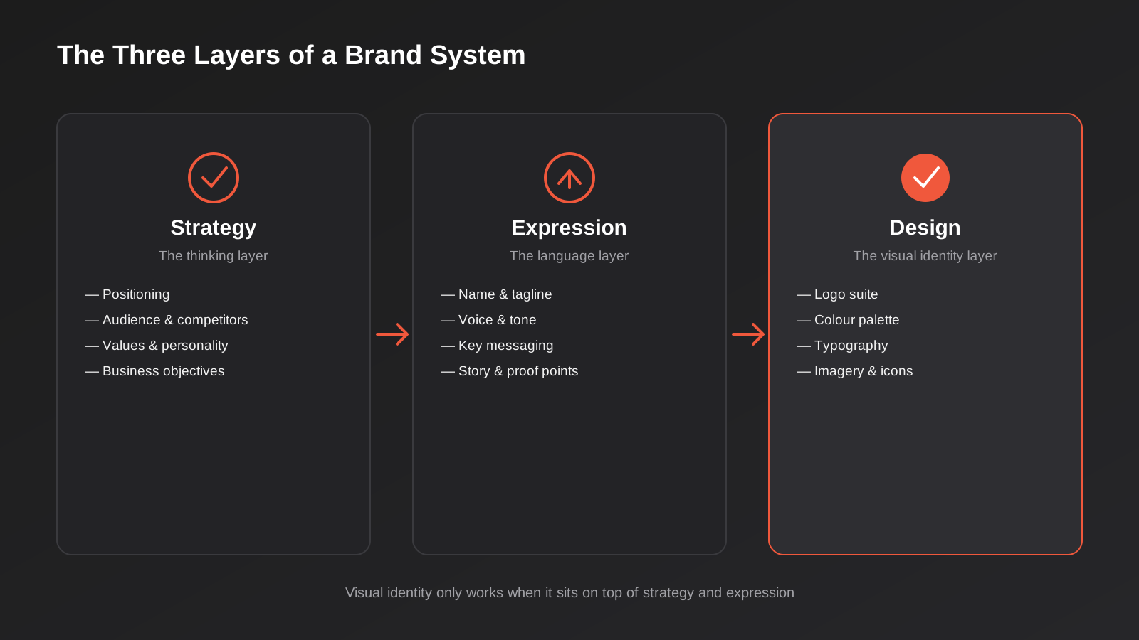
Strategy: the thinking layer
This is where you decide what the business is actually for. It includes your positioning (the specific space you occupy relative to competitors), a clear read on your target audience and what they actually care about, your values, and a short, honest list of business objectives the brand needs to support. Strategy work doesn’t need a 40-page document. For most small and mid-sized Australian businesses, it needs a single page that the owner and the design team both agree on before a single visual is produced. Skipping this step is the single biggest reason branding projects need to be redone within eighteen months.
Expression: the language layer
Expression turns strategy into words: your business name (if you’re naming or renaming), a tagline if you use one, your voice and tone, and the two or three key messages that show up consistently across your website copy, your ads and your sales conversations. A tradie business and a professional services firm might have identical strategic positioning (both are “the reliable local specialist”) but completely different expression, because the tone that builds trust with each audience is different.
Design: the visual identity layer
This is where most of the budget and most of the attention goes, and it’s the layer people mean when they say “branding” in casual conversation. It’s also the layer that fails fastest when it’s built without the two underneath it. A logo designed without a clear read on strategy tends to chase trends rather than fit the business, which is why so many rebrands happen not because the logo aged badly, but because it was never actually right.
What a Visual Identity System Actually Needs to Include
“Visual identity” gets treated as a synonym for “logo” more often than it should. A logo is one asset inside a visual identity system, and on its own it can’t carry a brand across a website, an invoice template, a vehicle wrap and a social feed. A working system needs five components, and each one needs to hold up outside the mockup it was first shown in.
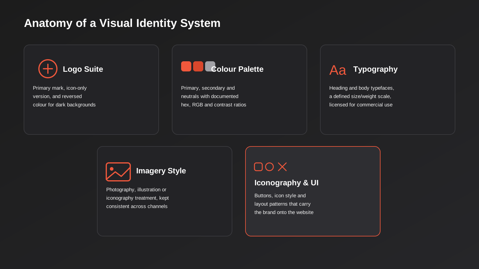
Logo suite. Not one file, a suite: a primary horizontal or stacked mark, an icon-only version for favicons and app tiles, and versions built for light and dark backgrounds. If your “logo” is a single PNG with a transparent background, it isn’t a suite, and someone on your team is about to squash it, stretch it, or drop it on a background it was never designed for.
Colour palette. A primary colour, one or two secondary colours, and a set of neutrals for text and backgrounds, each documented in hex, RGB and (if you print anything) CMYK or Pantone. This matters more than it sounds: we regularly inherit projects where the “brand blue” exists in four slightly different shades across the website, the email signature and the printed brochure, because nobody wrote the hex code down anywhere the whole team could find it. Contrast ratios matter here too, particularly for accessibility on the website — a colour that looks great in a mood board can fail WCAG contrast requirements for body text, which becomes a real problem the moment it’s implemented in a live design.
Typography. A heading typeface and a body typeface (they can be the same family in different weights, or two complementary families), with a defined size and weight scale so headings, subheadings and body copy stay consistent whether they’re built in Figma, Canva or directly in WordPress. Check licensing before you fall in love with a typeface — plenty of fonts that look free in a design tool require a commercial licence for web embedding, and finding that out after launch is an expensive surprise.
Imagery style. A decision on photography versus illustration versus icon-led design, and rules for how it’s applied: colour treatment, cropping style, whether people appear in imagery and how. This is the component that ages fastest if it’s not documented, because whoever is adding the next batch of website images or social tiles will default to whatever’s fastest to source, not necessarily what’s on-brand.
Iconography and UI elements. Icon style (line weight, corner radius, fill versus outline), button shapes, and layout conventions that carry the brand from static assets into an actual working website or app. This is the piece most branding projects leave out entirely, and it’s the piece that causes the most friction when a brand identity moves into web design and development, because a beautiful static brand board doesn’t tell a developer what a hover state or a form field should look like.
Brand Guidelines: Why a One-Page Doc Beats a 40-Page PDF Nobody Opens
We’ve seen both failure modes. The business with no documented guidelines at all, where consistency depends entirely on one designer remembering the rules in their head, and the business with a 40-page brand guidelines PDF that took weeks to produce and that nobody on the team has opened since the day it was delivered. Neither serves the actual purpose of a guidelines document, which is to let anyone — a new hire, a freelancer, an agency, a print shop — produce something on-brand without having to ask.
For most small and growing Australian businesses, the guidelines document that actually gets used covers:
- Logo usage rules: minimum size, clear space, and a short list of what not to do (don’t stretch it, don’t recolour it, don’t place it on a busy background)
- Colour codes in hex, RGB and print equivalents, with a note on which colours are for backgrounds versus text
- Typography hierarchy: which typeface and weight for H1s, H2s, body copy and captions
- Voice and tone basics: three or four adjectives that describe how the brand talks, with a short example of on-brand versus off-brand copy
- A handful of real applied examples — a business card, a social tile, a website section — so the rules aren’t abstract
That fits comfortably on one to three pages for most businesses. You need this document specifically when more than one person touches your marketing (an internal team, a freelancer, an agency, or all three), when you’re briefing a new website build, when you’re opening a second location or franchising, or when you’re onboarding new staff who’ll represent the brand in customer-facing material. If it’s genuinely just you, producing everything yourself, a documented guide is still useful as a decision record for future-you, but it doesn’t need the same level of formality.
Industry context changes what belongs in the guidelines too. We wrote about this in detail in our guide to dental practice website design and branding, where trust signals, compliant patient content and a calmer visual tone all need to be built into the guidelines specifically because healthcare buyers evaluate trust differently to, say, a retail customer choosing between two clothing brands.
Building vs Rebranding: How to Know Which One You Need
Confusing a refresh with a full rebrand wastes budget in both directions — either you underinvest in a genuine strategic problem by asking a designer to “just update the logo a bit,” or you spend rebrand-level money and time solving what was actually a much smaller visual inconsistency issue. The distinction matters most at the point someone internally says “we need to rebrand,” because that phrase gets used for both situations and the right next step is completely different depending on which one it actually is.
Before committing to either path, it’s worth getting specific about what’s actually prompting the conversation. “I don’t love how it looks anymore” is a taste signal. “Customers keep telling us they thought we did something different” or “we’ve moved upmarket and the visuals still look like the budget option we used to be” are positioning signals. Only the second kind justifies revisiting strategy.
Signs you need a full rebrand
A full rebrand — revisiting strategy, expression and design together — is usually justified when the business itself has fundamentally changed: you’ve merged with or acquired another business, you’re expanding into a market or industry your current positioning doesn’t fit, your current name or visuals carry negative associations you can’t shake, or your positioning has genuinely shifted (moving from budget to premium, or from generalist to specialist, for example). If your strategy has changed, keeping the old visual identity and hoping it still fits is how you end up with a brand that photographs well but doesn’t actually match what the business does or who it serves now.
Signs you need a visual refresh, not a rebrand
A refresh — updating the visual identity layer while keeping strategy and expression largely intact — fits when the positioning is still accurate but the execution has drifted: colours have crept off-palette across different channels, the logo hasn’t aged well typographically, or the visual identity was never properly documented so it’s inconsistent purely from lack of a system rather than lack of strategy. This is a faster, cheaper project, and trying to sell a client (or your own board) a full rebrand when what they actually need is a documented, consistently-applied refresh is a good way to lose trust in the process.
Where Branding Meets the Website (and Why the Handoff Breaks Most Projects)
The most common place we see a good brand identity fall apart is the handoff into web design and development. A brand board with a logo, three colours and a typeface pairing looks complete, but it doesn’t answer dozens of practical questions a website actually needs answered: what does a disabled button look like, how does the colour palette handle a form validation error in red without clashing, what’s the spacing scale between sections, how does the type hierarchy hold up on a 375px mobile screen versus a 1440px desktop.
This is the exact gap a design system is built to close — a documented, componentised set of rules that sits between “here’s our brand” and “here’s our actual website,” so a developer isn’t guessing what an on-brand dropdown menu should look like. Not every business needs a full design system on day one; a five-page brochure site probably doesn’t. But any business building or rebuilding a website with more than a handful of page templates, or one that expects to keep adding pages and features over time, saves real money down the line by getting this documented once rather than re-deciding it on every new page.
We’ve written before about a related version of this same handoff problem in landing page design vs development — the short version is that design and development are different skill sets solving different problems, and a brand identity that was never translated into development-ready specifications is one of the most common reasons a landing page build takes twice as long as it should.
The practical fix is sequencing the work so the visual identity project explicitly includes, or hands off cleanly into, decisions a developer can actually build from: a defined spacing scale rather than “whatever looks right,” documented interactive states (default, hover, active, disabled, error) for every button and form element, and a small library of layout patterns rather than a single hero-section mockup. None of that needs to happen inside the branding project itself, but it does need to happen before development starts, and naming that as a distinct phase — rather than assuming it’ll sort itself out once the developer opens the brand PDF — is what actually prevents the rebuild-in-eighteen-months cycle we mentioned earlier.
Cost and Timeframe: What Branding and Visual Identity Actually Take
Scope drives cost more than anything else here, and the honest answer is that “branding” covers a wide range of actual deliverables. A logo-only project, no strategy work, no guidelines document, is the cheapest and fastest option, but it’s also the one most likely to need revisiting within a year or two, because it skips the layers that make a visual identity actually fit the business. A full visual identity system — logo suite, colour palette, typography, imagery direction, a working guidelines document — sits in the middle, and is the right scope for most businesses that are past the “just need something professional” stage and into “need this to hold up across a growing number of channels” territory. A complete rebrand that starts with strategy and positioning work before any visuals are produced is the most involved and most expensive option, and it’s the right call specifically when the business itself has changed, not as a default starting point.
Timeframe follows the same logic: a focused visual identity project typically runs a matter of weeks, while a full rebrand that starts with strategy workshops, competitor research and stakeholder alignment before design begins takes longer, often a couple of months, because rushing the strategy phase is exactly how you end up needing to do this again in two years. If you want a clearer sense of how this fits alongside website and marketing budgets more broadly, our pricing page breaks down real ranges across services rather than vague “get a quote” placeholders.
A few things push cost and timeframe up regardless of which scope you choose. Multiple stakeholders who need to sign off (common in franchises, boards and family businesses) add review rounds that a sole decision-maker skips entirely. Existing assets that need to be reconciled — years of inconsistent colour usage across print, signage and digital, or a name that’s changing alongside the visuals — add discovery work before design can start. And any business that needs the visual identity translated into a working website in the same project, rather than handed off as static files, should budget for that as a connected but separate phase, not an afterthought tacked onto the end of the branding timeline.
What Makes a Visual Identity Actually Resonate With Australian Buyers
A visual identity system can tick every box on the checklist above — documented logo suite, accessible colour palette, licensed fonts — and still feel flat if it ignores what actually builds trust with the audience it’s meant to reach. Australian buyers, across most industries we work in, respond more to authenticity and straightforwardness than to polish for its own sake. A visual identity that leans too hard into generic, stock-photo corporate gloss tends to read as impersonal, particularly for local service businesses, trades, healthcare and professional services where the buying decision still comes down to “do I trust this business with something that matters.”
That doesn’t mean every Australian brand should look rustic or informal — plenty of categories (finance, technology, enterprise services) genuinely need a polished, premium visual language to be credible. It means the visual identity has to match how the target audience actually makes decisions in that category, not a generic idea of what “professional” looks like. An allied health clinic and a B2B software company can both have excellent visual identities that look nothing alike, because they’re solving for different trust signals with different audiences.
A few things we’ve learned matter more than they get credit for in the local context:
- Real photography over generic stock. Actual premises, actual team members and actual work (a finished job, a real product, a real space) consistently outperform stock imagery for trust, even when the stock photo is objectively better lit. This is especially true for trades, healthcare and hospitality, where customers are evaluating a real, local, physical experience.
- Consistency across the touchpoints customers actually use to verify you. Google Business Profile, reviews platforms and social channels get checked before a website in a lot of buying journeys now. A visual identity that looks sharp on the website but inconsistent on Google Business Profile or Facebook undermines the exact moment a prospect is deciding whether to trust you.
- Restraint over trend-chasing. Visual trends (a particular gradient style, a particular illustration approach) date quickly. A visual identity built around a durable, well-executed core system ages better than one built to look current in 2026 specifically.
For multi-location businesses, there’s an additional wrinkle: how much visual and messaging variation is acceptable location to location. Core visual identity — logo, colour palette, typography — should stay fixed across every location, full stop. Where some flexibility is reasonable is in supporting imagery and locally-relevant messaging (a Perth location referencing Perth landmarks or suburbs in its content, for instance), as long as it sits inside the same visual system rather than becoming its own mini-brand.
Common Mistakes
- Starting with the logo instead of the strategy. Skipping positioning and audience work means the designer is guessing at what the visuals need to communicate, which is why so many “we don’t love the new logo” conversations are actually strategy conversations in disguise.
- No documented colour codes. If your brand colour lives only as “that orange from the website,” expect it to drift across every new asset someone else produces.
- Choosing fonts without checking commercial licensing. A typeface that’s free for personal use in a design tool can require a paid licence for web embedding or commercial use — worth confirming before it’s baked into every template.
- Treating the logo as the whole brand. A strong logo with no supporting colour system, typography rules or imagery direction leaves everyone downstream — your web developer, your social media manager, your print supplier — making it up as they go.
- Rebranding on personal taste rather than positioning. “I’m tired of looking at this colour” is a legitimate feeling and a bad reason to spend a rebrand budget if the actual positioning hasn’t changed.
- Producing a visual identity with no plan for how it becomes a website. A brand board that was never translated into component-level design decisions (buttons, forms, spacing, states) turns every new web page into a fresh round of guesswork.
- Ignoring accessibility in the colour palette. A palette that looks striking in a mood board can fail contrast requirements for real body text, which is a compliance and usability problem, not just an aesthetic one.
Frequently Asked Questions
What’s the actual difference between brand identity and visual identity?
Brand identity is the full picture: positioning, values, personality, voice and the promise a business makes to its customers. Visual identity is the visible subset of that: logo, colour palette, typography, imagery and iconography. Visual identity should be built to express an already-defined brand identity, not stand in for one.
Do I need formal brand guidelines if I’m a solo business owner?
You need less formality than a multi-location business, but a short, one-page reference (logo rules, hex codes, fonts, a couple of tone notes) is still worth having the moment you bring on a freelancer, an agency or even just a template you didn’t design yourself. It saves you from having to re-decide the same details every time.
How much does brand identity design cost in Australia?
It depends heavily on scope. A logo-only project is the cheapest option but the most likely to need revisiting. A full visual identity system with a documented guidelines file sits in the middle and suits most growing businesses. A complete rebrand that starts with strategy and positioning work is the most involved and costs accordingly. Our pricing page has real ranges rather than vague estimates.
Can I build a visual identity myself with a tool like Canva?
You can produce visual assets that way, and plenty of small businesses start there. What Canva and similar tools don’t do for you is the strategy work underneath — positioning, audience definition, differentiation — so a DIY visual identity built without that foundation tends to look reasonable in isolation but drift and feel generic once it’s applied across more channels.
How often should a business review or refresh its brand identity?
There’s no fixed schedule, but it’s worth a genuine review whenever the business’s positioning has shifted, when you notice visual inconsistency creeping in across channels, or roughly every few years as a health check even if nothing seems obviously wrong. A review doesn’t have to mean a rebrand — often it surfaces a documentation gap rather than a strategy problem.
What’s the difference between a style guide and a design system?
A style guide documents brand rules: logo usage, colours, typography and voice, mostly for static and marketing applications. A design system goes further, defining reusable components (buttons, forms, navigation, states) built specifically for a website or product, so brand consistency holds up in an interactive, ever-growing digital environment rather than just on a one-page PDF.
Where to Start
If you’re not sure whether your business needs a strategy session, a visual identity system, a documented guidelines file, or a full rebrand, that’s a genuinely normal place to be — most businesses can’t tell from the inside, because the inconsistency that’s obvious to a new customer is often invisible to a team that’s used to it. The fastest way to find out is a straightforward conversation about where things currently stand and what’s actually driving the request, before anyone talks about logos or colour palettes. If that’s useful, our branding and visual identity team is a good place to start that conversation.
Keep reading
Related posts
Dark Patterns in Website Design: What Australia’s Unfair Trading Practices Law Means for Your Site
Dark patterns in website design explained: what counts, how Australia’s incoming unfair trading practices law applies, and what to build instead.
Graphic Design for Australian Businesses: What You Actually Need (and When Canva Stops Being Enough)
What graphic design actually covers for Australian businesses, real 2026 pricing, and a practical framework for when DIY tools stop being enough.

Design Systems: Do You Actually Need One? A Practical Guide for Australian Businesses (2026)
Design systems get sold to every business. Here's a practical framework for when you actually need one, real 2026 Australian costs, and…
Got a project you'd like to talk through?
Tell us what you're working on — we'll come back with a plan.
