
Website Design and Branding for Dental Practices: The Complete Guide (2026)
 Jignesh Vagadiya
19/08/2026
22 min read
Jignesh Vagadiya
19/08/2026
22 min read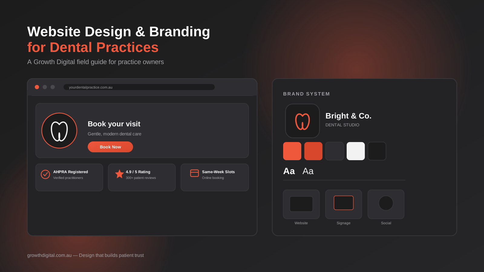
Most dental practices treat their website and their branding as two separate jobs — a logo gets designed once, filed away, and forgotten, while the website gets rebuilt every few years by whoever’s cheapest at the time. We’ve built and rebuilt enough dental sites to know that’s backwards. The practices that consistently fill their books aren’t the ones with the flashiest homepage or the cleverest tagline — they’re the ones where the logo, the colour palette, the photography, the booking flow and the actual words on the page all say the same thing, consistently, everywhere a prospective patient might encounter them. Design and brand identity aren’t decoration sitting on top of a marketing strategy. For a dental practice, they are the strategy, because dentistry is a trust purchase before it’s anything else.
This guide covers both halves of that equation — what makes a dental website actually convert visitors into booked appointments, and what a genuine brand identity looks like once you get past the logo. We’re covering them together deliberately. A beautifully branded practice with a clunky booking form loses the patient at the finish line. A slick, fast website with generic stock-photo branding never earns enough trust to get the visitor to the form in the first place. You need both working in the same direction.
We work with dental and other healthcare practices across Australia on exactly this combination, and the pattern we see over and over is that the practices losing enquiries usually aren’t losing them for lack of traffic. They’ve got people arriving on the site — from Google, from referrals, from a Facebook ad — who simply don’t convert once they land, because something in the experience doesn’t add up to trust. Fixing that is rarely about one dramatic redesign. It’s usually a series of specific, fixable gaps in the booking flow, the trust signals, the brand consistency, or the mobile experience, and this guide walks through each of them in turn.
Why Your Website Is Your Practice’s First Clinical Impression
Before a new patient sits in your chair, they sit with your website. For most practices, that’s the entire relationship up to the point of booking — no phone call, no referral conversation, just a screen. That means your website is doing a job your reception team would normally do in person: putting an anxious or unfamiliar person at ease, answering their obvious questions, and making the next step obvious. Most dental websites fail at this not because they look bad, but because they were built to look like a brochure rather than function like a first consultation.
The seven-second trust test
Patients researching a new dentist typically have several tabs open at once, comparing two or three practices in the same suburb. In the first few seconds on your site, they’re not reading your copy — they’re pattern-matching. Does this look current or dated? Are these real people or stock photos that also appear on four other dental sites? Is this practice still operating, or did they stop updating the site in 2019? Fail that pattern match and the back button gets pressed before a single word is read. This is why visual design carries more weight in dental marketing than in most other industries — it’s not vanity, it’s the first and fastest filter a nervous prospective patient applies.
What “professional” actually signals to a nervous patient
A meaningful share of adults delay or avoid dental visits because of anxiety, cost concerns, or a bad past experience. Your website is talking to that person as much as it’s talking to someone who just wants a routine clean. “Professional” in this context doesn’t mean sterile or corporate — it means competent, calm and current. Clear photography of your actual team and premises, plain-English explanations of procedures instead of clinical jargon, and a design that feels considered rather than templated all do real work in lowering the guard of someone who’s putting off a phone call out of nerves. This is also where generic dental website templates fall down: they read as competent but interchangeable, and interchangeable doesn’t build the specific trust a nervous patient needs to make first contact.
The Website Elements That Actually Convert Visitors Into Booked Patients
There’s no shortage of dental websites that look impressive in a screenshot and still convert poorly. The gap is almost always in the mechanics — the parts a design pitch deck doesn’t show off but that determine whether a visitor actually becomes an appointment.
A booking flow that doesn’t lose people
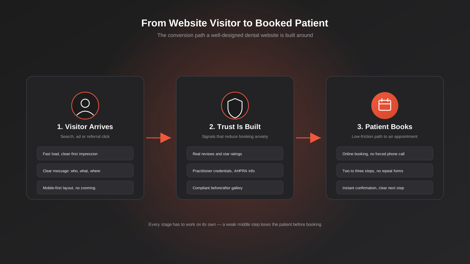
Every extra step, every unnecessary field, and every moment of uncertainty about what happens next costs you bookings. We treat the booking flow as the single most important sequence on a dental website, more important than the homepage hero. A few things we build into every dental site we work on:
- A visible, consistent call-to-action — “Book Online” or “Book an Appointment” — in the same position on every page, not buried in a dropdown menu.
- A booking button that works identically whether it opens a scheduling tool, dials the practice, or opens a short enquiry form — never a dead link or a page that just repeats the phone number.
- A short path for new patients specifically, since “new patient” and “existing patient” often have completely different next steps (forms, health history, insurance details) that shouldn’t be forced into one generic form.
- Confirmation of what happens after the visitor submits — a confirmation screen or message, not silence.
If your current booking process asks a new patient to fill in twelve fields before they’ve even spoken to a human, you’re filtering out exactly the low-commitment, high-anxiety visitors who are most likely to abandon rather than push through. Reduce friction first; you can always collect detailed intake information once the appointment is actually booked.
Trust signals that matter
Trust signals aren’t badges scattered in a footer — they’re specific, verifiable pieces of information placed where the decision is actually being made. For a dental practice, the trust signals that do the most work are:
- Real photography of your practitioners, front-of-house team and premises — not stock imagery of generic smiling models.
- Practitioner qualifications, AHPRA registration and areas of interest, presented plainly rather than buried in a PDF.
- Genuine patient reviews, ideally pulled live from Google rather than hand-picked quotes with no way to verify them.
- Clear, current information about fees, payment plans and health fund arrangements — cost uncertainty is one of the biggest silent reasons people don’t enquire.
- Emergency contact information that’s actually monitored, clearly separated from general enquiries.
Notice none of these are “design elements” in the visual sense. They’re information architecture decisions — what you choose to surface, and where, tells a visitor how much you have to hide.
Content that answers questions before the phone rings
A surprising share of the objections that stop someone from booking can be answered on the page, before they ever have to ask. Clear, plain-English content on individual procedure pages — what actually happens during a root canal, how long recovery from an extraction takes, what a first visit for a nervous child looks like — does double duty. It reduces pre-appointment anxiety for the patient, and it reduces the volume of basic questions your front desk fields on the phone. We treat a practice’s procedure pages and FAQ content as part of the conversion path, not as a separate “content marketing” exercise bolted on afterwards. Written well, this content also tends to perform strongly for search — patients research symptoms and procedures long before they search for a specific practice name, and thorough, genuinely useful content is what earns visibility at that earlier stage of the journey.
Before-and-after galleries — done ethically and compliantly
Before-and-after galleries are one of the highest-converting content types on a cosmetic or restorative dental website — nothing communicates capability faster than visible results. They’re also one of the areas where we see practices get themselves into trouble, because advertising of regulated health services in Australia sits under AHPRA guidelines that specifically govern testimonials and before-and-after imagery for dental and cosmetic procedures. The detail of what is and isn’t compliant changes and depends on your specific service mix, so we won’t attempt to summarise the rules here — that’s a conversation for your practice’s compliance advisor or AHPRA’s own published guidance. What we will say from a design and marketing perspective: build your gallery structure so that consent documentation, accurate representation and any required disclaimers are handled properly from day one, rather than retrofitted after a gallery’s already live. Getting your marketing team and your compliance obligations talking to each other early is far cheaper than a takedown notice later.
Mobile experience: where most dental sites lose patients
The majority of dental website traffic now arrives on a phone, often from a Google search made in the moment — a chipped tooth, a persistent ache, someone Googling “emergency dentist near me” from the car park. If your mobile site is a shrunk-down version of the desktop layout, with tiny tap targets and a booking button that’s three scrolls down, you’re losing exactly the highest-intent visitors at exactly the moment they’re most ready to act. Things we check on every dental mobile build:
- Click-to-call phone numbers that work as an actual tap, not just styled text.
- A booking or contact action visible without scrolling, on every page, not just the homepage.
- Page load speed — heavy, unoptimised images are still the single biggest cause of slow dental websites we encounter, and slow-loading pages lose mobile visitors within seconds.
- Forms that use appropriate mobile keyboards (numeric keypad for phone fields, and so on) and don’t require pinch-zooming to complete.
Mobile isn’t a secondary experience to be tolerated — for most dental practices today, it’s the primary one, and it deserves to be designed first rather than adapted last.
Brand Identity Fundamentals for Dental Practices
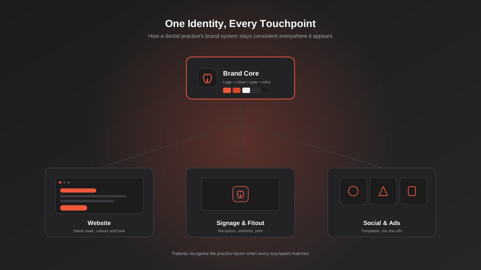
A brand identity is not a logo. It’s the full set of visual and verbal decisions — mark, colour, type, tone, imagery style — that make your practice recognisable and consistent no matter where someone encounters it. For a dental practice specifically, brand identity is doing something quite practical: it’s reassuring a patient, subconsciously, that the same standard of care and professionalism applies whether they’re looking at your signage from the street, your Instagram page, or the intake form in your waiting room.
Logo and visual mark — more than a tooth icon
Dental branding has a well-worn visual language — a tooth silhouette, a smile arc, a cross, usually in blue or teal. There’s nothing wrong with referencing dental iconography, but leaning on the same handful of clichés is how practices end up visually indistinguishable from three competitors in the same postcode. A strong dental logo needs to work at genuinely small sizes (a favicon, a social media avatar), reproduce cleanly in a single colour for embroidered uniforms or signage vinyl, and hold up next to a practice name that might be long or include multiple practitioner surnames. We’d rather start from what makes a specific practice distinctive — a particular specialty, a family-run history, a design-forward fitout — than default to generic dental iconography because it’s the safe, expected choice.
Knowing who the brand is actually speaking to
A brand identity built without a clear sense of the audience tends to drift toward the middle — inoffensive, forgettable, trying to appeal to everyone at once. A family practice targeting parents booking for young children needs a fundamentally different visual and verbal tone to a practice built around cosmetic and implant work targeting professionals in their thirties and forties, and both are different again from a practice positioning itself around anxiety-free or sedation dentistry for people who’ve avoided the dentist for years. None of this needs to be an elaborate exercise — it’s simply being specific and honest about who you actually see most, and what that person needs to feel before they’ll book, then letting that understanding shape the tone, the imagery, and even which services get top billing on the homepage.
Colour psychology in a healthcare context
Colour choice in dental branding isn’t arbitrary, and it’s not purely aesthetic either — it’s doing psychological work on a visitor who may already be anxious. Blues and teals dominate the industry because they read as clean, clinical and calm, which is exactly why so many practices default to them and end up looking the same as everyone else. Warmer palettes — considered use of coral, sage, warm neutrals — can differentiate a practice while still reading as calm and trustworthy, particularly for family or cosmetic-focused practices trying to feel less clinical and more approachable. The technical detail that actually matters in practice: whatever palette you choose needs sufficient contrast for accessibility (patients with low vision are a real part of your audience), and it needs to hold up consistently across a screen, a printed sign, and an embroidered polo shirt, which are three very different colour reproduction environments.
Typography and tone of voice
Typography gets less attention than logo and colour in most branding conversations, but it’s doing constant, quiet work — a clinical, ultra-geometric sans-serif reads differently to a warmer, rounder typeface, even when the words are identical. Pair your typography decisions with a genuine tone-of-voice standard: does your practice write in plain English or lean on clinical terminology? Is the voice warm and personal, or efficient and reassuring-through-competence? Neither is wrong, but it needs to be a decision, applied consistently across your website copy, appointment reminder texts, and social captions — not whatever tone the person drafting that particular piece of content happened to land on.
Consistency across signage, website, and socials
This is where most dental brand identities quietly fall apart. The logo on the website is a slightly different blue to the one on the shopfront sign, which is different again from the one on the Facebook page profile picture, which was resized badly and now looks pixelated. None of these are dramatic failures individually, but together they undermine the exact thing branding is meant to build — the subconscious sense that this is one coherent, well-run practice. The fix isn’t complicated, just disciplined: a single brand asset library with locked colour values (in HEX, RGB and CMYK, since you’ll need all three across digital and print), locked logo files in the correct formats, and a short one-page style guide that anyone briefing a new sign, a new uniform order, or a new social post can refer back to. For multi-practitioner practices, it’s worth extending that discipline to email signatures, appointment reminder templates and even the language used on hold music or voicemail — small touchpoints that get overlooked in a brand rollout but that a returning patient will still notice, consciously or not, if they’re out of step with everything else.
Local SEO for Dental Practices
Design and brand identity get a prospective patient to trust you once they’ve found you — local SEO is what gets you found in the first place, and for a dental practice serving a specific suburb or region, it’s arguably the highest-leverage marketing channel available. Your Google Business Profile, consistent name-address-phone details across directories, localised service pages, and genuine local review volume all feed into whether you appear in the map pack when someone nearby searches “dentist near me” or “emergency dentist [suburb]”. We won’t duplicate that whole topic here — we’ve covered local SEO in depth, including the mechanics specific to the Australian market, in our local SEO guide. The short version for this guide: a beautifully branded, high-converting website still needs to be found, and local SEO is what puts it in front of the right people at the moment they’re searching.
How Design, Identity and Conversion Work Together
Treating website design, brand identity and local SEO as separate projects — often run by separate people or agencies, on separate timelines — is the single most common structural mistake we see in dental marketing. They’re not separate projects. They’re one patient journey viewed from three different angles.
The patient journey isn’t linear
A new patient rarely goes straight from a Google search to a booking. More often it’s a search, then a look at reviews, then a visit to the website, then a check of the practice’s Instagram to see what the space actually looks like, then maybe a question to a friend who’s been there, and only then a booking. Every one of those touchpoints is a branding touchpoint. If the website is polished but the Instagram feed hasn’t been updated in eight months and uses an old logo, that inconsistency registers — maybe not consciously, but it registers as a small doubt at exactly the point you need certainty.
Brand trust reduces booking friction
This is the part that’s easy to underrate: a strong, consistent brand doesn’t just look nicer, it measurably lowers the psychological cost of booking. When every touchpoint reinforces the same competent, considered impression, a prospective patient needs less convincing by the time they reach your booking form — they’ve effectively been pre-sold on trust before they ever typed in their name and phone number. Practices that treat brand and conversion as separate disciplines usually end up over-engineering the booking form to compensate (more trust badges, more testimonials, more reassurance copy crammed onto one page) instead of fixing the actual gap, which is that trust wasn’t built earlier in the journey.
Content and social proof, within compliance
Genuine patient reviews, plain-English educational content about procedures, and real photography of your team and premises are the backbone of ongoing trust-building content for a dental practice. As with before-and-after galleries, testimonials and patient-outcome content for a regulated health service need to be handled with an eye to AHPRA’s advertising guidelines — the specifics of what’s compliant depend on the content and should be checked with your compliance advisor rather than assumed from a competitor’s website. From a marketing standpoint, the practices that get the most long-term value from social proof are the ones who build a simple, repeatable, compliant process for collecting and publishing it, rather than an occasional scramble to find a testimonial when the website’s being rebuilt.
Measuring whether it’s actually working
None of this is worth much if you can’t tell whether it’s moving the number that matters — booked appointments, not just website visits. That means basic analytics tracking on the booking flow itself: how many people click through to the booking step, how many complete it, and where in the process people drop off. If a practice is getting healthy traffic but a low completion rate on its booking form, that’s a design and friction problem, not a traffic problem, and more advertising spend won’t fix it. We’d rather see a practice with modest traffic and a well-tuned conversion path than one pouring money into ads that land on a site quietly leaking most of its visitors before they ever reach the phone number.
Common Mistakes We See in Dental Website and Branding Projects
- Rebuilding the website without touching the brand. A new site built on an old, inconsistent brand just makes the inconsistency load faster and more visibly — a sharp new layout only draws more attention to a logo or colour palette that hasn’t kept pace.
- Using generic dental stock photography. Patients recognise stock imagery, even subconsciously, particularly when the same smiling model turns up on three other local practice websites, and it undercuts exactly the trust the page is trying to build.
- Hiding the booking action behind multiple clicks. Every additional step between “interested” and “booked” loses a percentage of visitors who won’t come back to try again later, no matter how good the rest of the site looks.
- Treating mobile as an afterthought. Building for desktop first and shrinking it down produces a worse experience for the majority of your actual visitors, who are searching from a phone in a moment of genuine need.
- Publishing before-and-after content without a compliance process. Assuming a gallery is fine because a competitor has one is not a compliance strategy, and it leaves the practice exposed if consent or representation issues are ever raised.
- Inconsistent logo files and colour values across signage, uniforms and digital. Small drifts compound into a brand that looks uncoordinated even when every individual asset was well designed in isolation.
- No clear differentiation from every other practice in the suburb. A tooth icon, a blue palette and the word “gentle” in the tagline describes most dental websites in the country, and none of it gives a comparison-shopping patient a reason to choose you specifically.
- Ignoring page speed. Unoptimised images and bloated page builders quietly cost bookings from mobile visitors who never wait for the page to finish loading, often without the practice ever knowing those visitors existed.
- Letting the website go stale after launch. A site that isn’t revisited — new team photos, updated hours, current pricing — slowly drifts out of date, and patients notice outdated information faster than practices expect.
Frequently Asked Questions
How much should a dental practice budget for a new website?
It depends heavily on scope — a template-based site with basic booking integration sits at the lower end, while a fully custom design with bespoke photography, a booking system integration and ongoing SEO support costs considerably more. The bigger question we’d encourage practices to ask isn’t the upfront cost but the expected return: a website that converts an extra handful of new patients a month typically pays for itself within a year, which a cheap, low-converting site never will, regardless of its sticker price. Our website pricing page breaks down what drives that range in more detail.
Do I need a completely new logo, or can I refresh what I already have?
Most established practices don’t need to start from scratch — a refresh that tightens up the existing mark, standardises the colour values, and modernises the typography usually preserves the recognition you’ve already built while fixing the inconsistencies that have crept in over time. A full rebuild makes more sense when the existing brand actively works against the practice — outdated iconography, a name change, a merger, or a genuine repositioning of the services on offer.
Can we use before-and-after photos of patients on our website?
Before-and-after content can be powerful, but as a regulated health service in Australia, dental practices need to handle it within AHPRA’s advertising guidelines, which specifically address testimonials and outcome imagery. This includes matters like informed consent, accurate representation and appropriate disclaimers. We’d always recommend checking the current guidelines, or speaking with your practice’s compliance advisor, before publishing this type of content rather than relying on what other practices are already doing.
How long does a website and branding project typically take?
For a combined brand identity and website project, expect a process that runs across several weeks to a few months depending on scope — discovery and strategy, brand development, website design, build and content, then testing before launch. Projects that try to compress this into a couple of weeks usually end up cutting corners on exactly the elements — photography, copywriting, booking flow testing — that determine whether the finished site actually converts.
Will a better website actually bring in more patients, or is that mostly marketing spend?
A better website on its own won’t generate traffic — that’s the job of local SEO, advertising and referrals. What it does is convert a higher percentage of the visitors you’re already getting, and it makes every other marketing channel more effective, because paid traffic and SEO traffic both land on that same site. We consistently see practices spending on advertising to drive traffic to a website that’s quietly losing a large share of it at the booking step — fixing the site first is usually the higher-leverage move.
Should every location get its own branding if we run multiple practices?
Generally no — multi-location practices get the most value from one consistent brand identity applied across every location, with local SEO and local page content handling the differentiation between suburbs, rather than each location developing its own visual identity. Consistency across locations reinforces trust for patients who move between suburbs or research the group as a whole, while inconsistent branding across locations can read as a loosely affiliated franchise rather than one coherent practice group.
Where to Start
If you’re looking at your own website and brand and recognising a few of the issues above, the starting point isn’t necessarily a full rebuild. It’s an honest audit — where is the booking flow losing people, where is the brand inconsistent across touchpoints, and where is the mobile experience falling short of what your traffic actually needs. From there, the fixes can usually be sequenced sensibly rather than tackled all at once. We work with dental and healthcare practices on exactly this combination — design, brand identity and conversion — because treating them as one connected system is what actually moves the number that matters: booked appointments. If you’d like a second set of eyes on where your current site and brand are costing you patients, we’re happy to talk it through.
Keep reading
Related posts
Best Website Hosting for Australian Businesses (2026): 6 Options Compared
We compare six hosts Australian businesses actually use in 2026 — real drawbacks, data centre locations and pricing traps included.
Website Redesign Without Losing Rankings or Revenue: A 2026 Guide for Australian Businesses
How to redesign your website without losing SEO rankings or leads: the audit, redirect map, QA and 90-day process Australian businesses need.
Core Web Vitals in 2026: A Practical Guide to LCP, INP & CLS for Australian Websites
A practical guide to Core Web Vitals for Australian businesses: what LCP, INP and CLS measure, how to test them properly, and…
Got a project you'd like to talk through?
Tell us what you're working on — we'll come back with a plan.
