
Landing Page Copywriting That Converts: Writing the Words Your Design Can’t Carry Alone
 Jignesh Vagadiya
30/10/2026
21 min read
We get sent a lot of landing pages to review. The pattern is almost always the same: the design is genuinely good — clean layout, decent hierarchy, a button in a colour that actually stands out — and the page still isn’t converting. Nine times out of ten, the problem isn’t the design. It’s that nobody wrote the page to do a specific job. Someone wrote it to describe the business.
A landing page only has one visitor, one piece of context (whatever ad, email or search result sent them there) and one shot at getting them to act. That’s a completely different writing problem to a homepage or an About page, and most businesses write it exactly the same way — polite, comprehensive, and about them instead of about the person reading it.
This is a practical guide to landing page copywriting that actually carries weight: how to structure the argument, which frameworks to borrow from and when, how to handle objections and proof without sounding like a used car ad, and where Australian advertising law puts a hard stop on certain tactics. We’ll also cover where copy and design genuinely overlap, and where they don’t — because a lot of underperforming pages fail at that handoff, not inside either discipline on its own.
Why Landing Page Copywriting Is a Different Job to Website Copy
Most website copy has to serve a visitor who could be anywhere in their decision — just browsing, comparing, already a customer looking for a support page. It hedges, because it has to cover several intents at once. Landing page copy doesn’t get that excuse. By the time someone lands on a dedicated campaign page, you already know roughly what they want, because you’re the one who sent the ad, the email or the search result that put them there. The job of the copy is to confirm, fast, that they’re in the right place, then move them toward one specific action without anything else competing for their attention.
That’s the real difference. It’s not that landing page copy is shorter, flashier, or more “salesy” — plenty of high-converting pages run long and fairly plain. It’s that every sentence on the page has to serve the one conversion goal. A homepage can afford a paragraph that exists purely for brand tone. A landing page can’t. If a line isn’t moving the visitor toward the action or removing a reason not to take it, it’s dead weight, and dead weight costs you conversions you already paid for in ad spend.
Message match: the thing most pages get wrong before the copy even starts
Before a single word of landing page copy gets written, check what promise got the visitor there in the first place. If the ad says “free quote in 24 hours” and the landing page headline talks about “industry-leading solutions,” you’ve broken message match, and a chunk of your traffic bounces in the first few seconds because the page doesn’t feel like it followed through on what they clicked. This sounds obvious written down, but it’s the single most common fault we find auditing underperforming pages — the ad team and the page writer never compared notes.
The fix is simple in principle: the landing page headline should echo the specific promise in the ad, keyword or email that drove the click, not a generic version of your value proposition. If you’re running several ad variants with different angles, you genuinely need matching page variants, not one page trying to catch all of them. This is exactly the kind of multi-variant build our landing page development team sets up the tracking for, so each ad angle has its own matching page rather than one generic compromise.
Start With the Problem, Not the Product
The instinct for most business owners writing their own landing page is to lead with what they do. “We’re a Melbourne-based agency specialising in…” That’s a sentence about you, and the visitor hasn’t decided yet whether they care about you. They care about their problem. Leading with the product description before establishing that you understand the problem is the copywriting equivalent of a salesperson launching into a pitch before asking what the customer actually needs.
Flip the order. State the problem or the desired outcome in language the visitor would use themselves — not internal jargon, not the phrase your industry uses to describe it, the phrase a frustrated person googling at 9pm would actually type. Then introduce the product as the answer to that specific problem, not as a list of features. “Get your quote without the usual three-week wait” says more to a frustrated visitor than “streamlined quoting process,” even though they’re describing the same thing.
The headline’s only job is to keep them reading
A landing page headline isn’t there to summarise your business. It’s there to do one thing: convince the specific person who clicked the ad that they’re in the right place and it’s worth reading the next line. That’s a much narrower job than most headlines try to do. We regularly see headlines trying to communicate the value proposition, the differentiator, and the brand tone all in one sentence, and they end up doing none of those things well because they’re answering three questions a visitor hasn’t asked yet.
A good test: if you covered the rest of the page and only showed someone the headline and subheadline, would they know what to do next and why they’d want to? If the answer requires reading three more paragraphs first, the headline isn’t doing its job yet.
Copywriting Frameworks That Actually Earn Their Place
Frameworks get a bad reputation in copywriting circles because people apply them mechanically, filling in blanks rather than thinking about the actual visitor. Used properly, though, a framework is just a proven shape for an argument — it stops you from wandering, and it’s a useful starting structure when you’re staring at a blank page trying to write for a stranger you’ll never meet.
PAS: Problem, Agitate, Solve
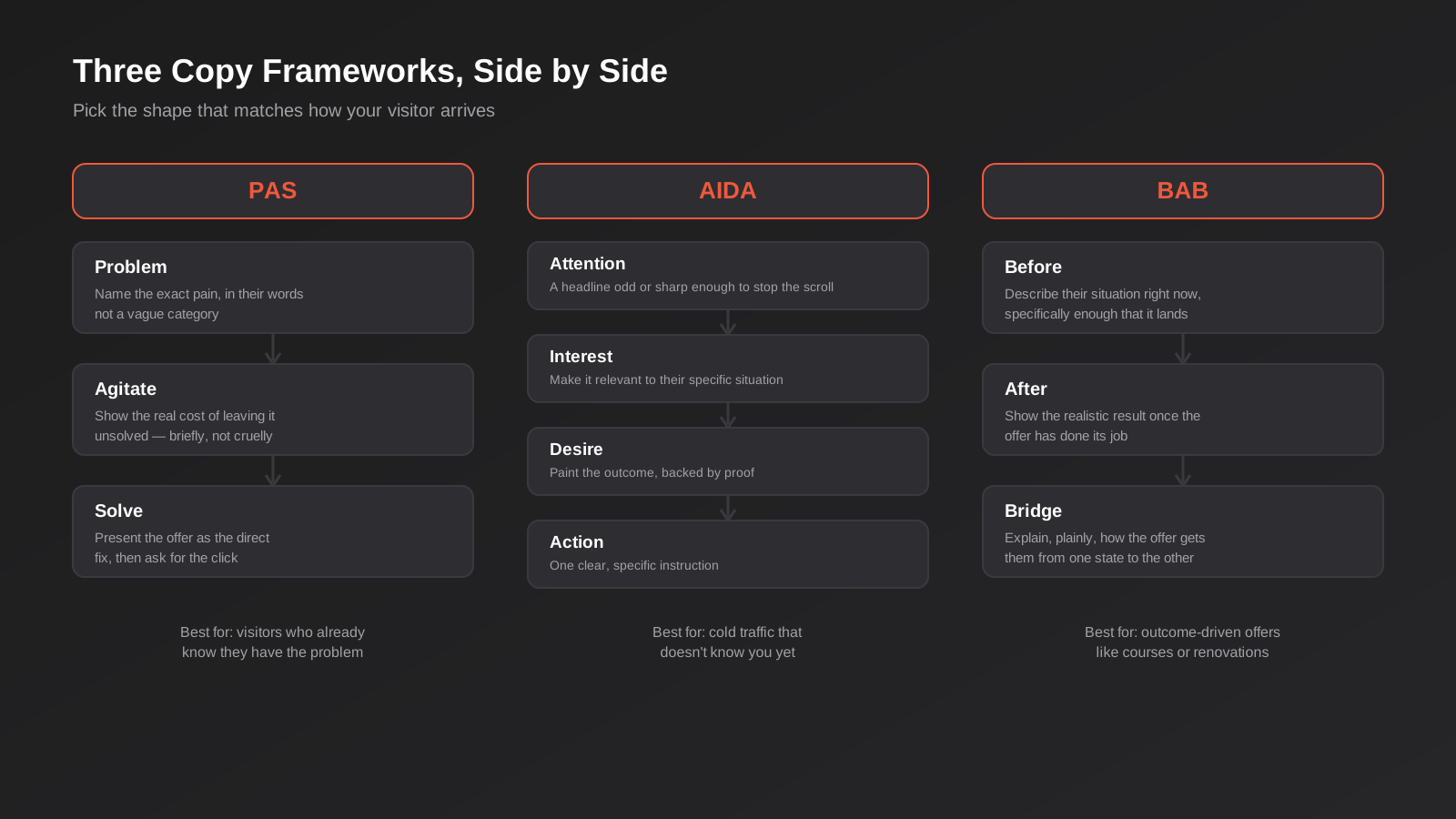
PAS works best when the visitor already knows they have a problem — they searched for it, clicked an ad about it, or came from an email addressing it directly. You name the problem specifically, spend a line or two on the real cost of leaving it unsolved (without becoming cruel about it), then present your offer as the direct fix. It’s a tight, fast structure, which makes it well suited to shorter pages and bottom-of-funnel search traffic where the visitor doesn’t need convincing that the problem exists — they need convincing that you’re the right fix.
AIDA: Attention, Interest, Desire, Action
AIDA earns its keep with colder traffic — people who haven’t actively been searching for a solution and need to be brought along more gradually. Attention is the hook, Interest makes it personally relevant, Desire builds the emotional and practical case with proof, and Action is the specific instruction. It’s a longer arc than PAS, and it suits pages where you’re introducing a less familiar offer or targeting an audience further from a buying decision, such as cold social traffic or a brand-awareness campaign that’s testing a new audience.
BAB: Before, After, Bridge
BAB is built for outcome-driven offers — renovations, courses, fitness programs, anything where the value is a transformation rather than a transaction. You describe the visitor’s current state specifically enough that they recognise themselves in it, paint a realistic picture of the after state, then explain plainly how your offer bridges the two. The risk with BAB is overselling the “after” into something unbelievable; keep it grounded in what the offer can actually deliver; it’s a framework for genuine transformation, not a courtroom argument.
None of these frameworks are mutually exclusive, and most strong pages borrow from more than one — a PAS opening followed by a BAB-style outcome section further down isn’t unusual. The point of knowing them isn’t to pick one and follow it rigidly; it’s to recognise which emotional job each section of your page needs to do, and borrow the shape that does it best.
Structuring the Page: The Order the Argument Actually Works In
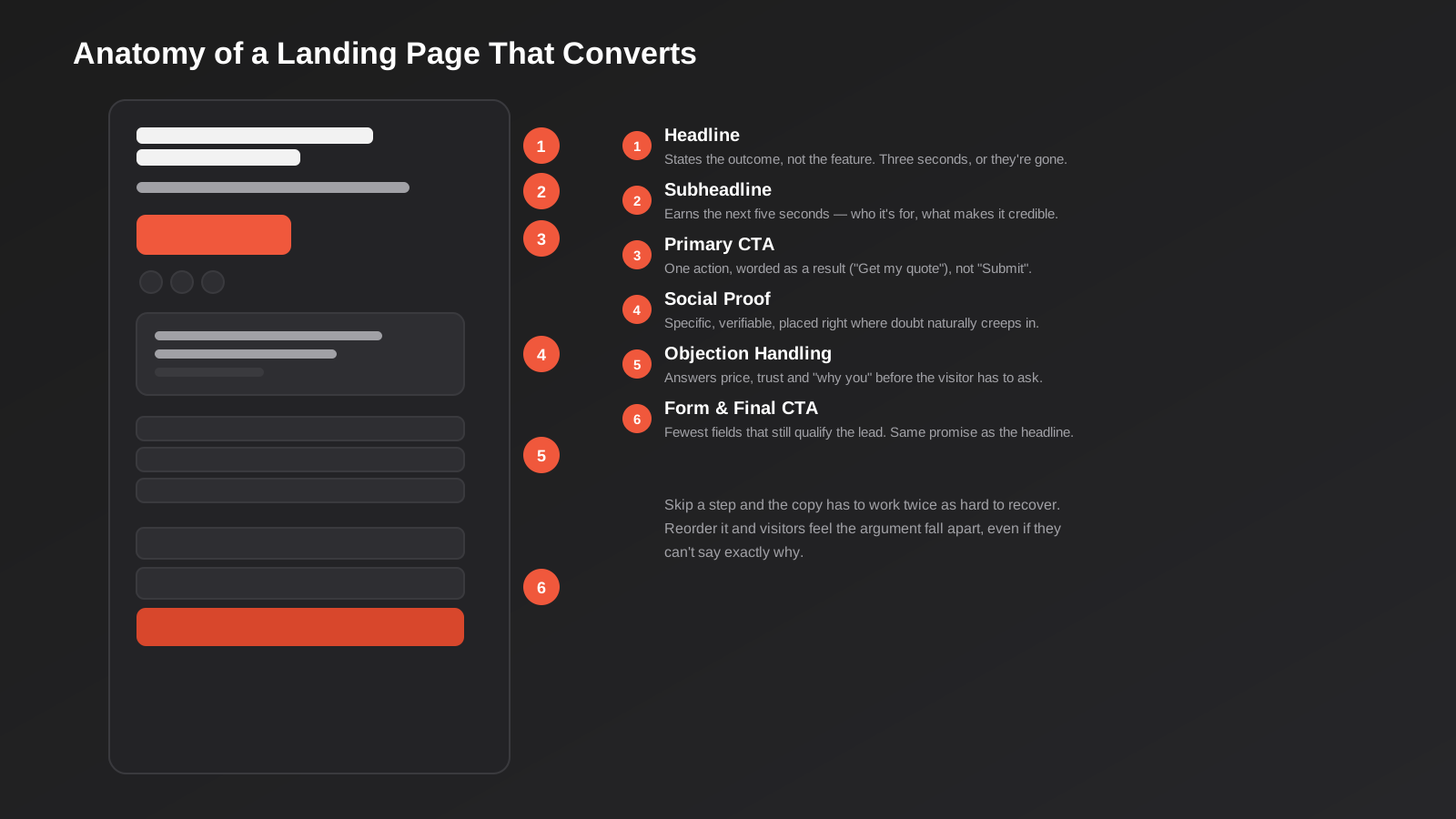
Copy and layout are the same decision made twice — structure is an argument, and the visual hierarchy either supports that argument or fights it. This is the main reason copy and design on a landing page need to be planned together rather than handed off as separate jobs; a beautifully laid-out page built around copy that argues in the wrong order still underperforms. If you’re trying to work out which of those two problems you actually have on an existing page, our piece on landing page design versus development breaks down where each discipline’s responsibility starts and ends.
Above the fold: confirm, don’t convince yet
Everything visible without scrolling has one job: confirm the visitor is in the right place and give them a reason to keep going. That’s the headline, a supporting subheadline, and usually a single clear call to action. Resist cramming a testimonial, three value propositions and a countdown timer into this space because someone read that urgency converts — above the fold isn’t where you win the argument, it’s where you earn permission to make it.
Objection handling: answer before they have to ask
Every offer has a handful of predictable objections — price, trust, “will this actually work for my situation,” “what happens if it doesn’t.” The pages that convert well don’t wait for a visitor to scroll away and go looking for the answer elsewhere; they address the two or three biggest objections directly, usually in the middle third of the page, once there’s been enough context for the objection to actually surface in the visitor’s mind. Burying objection handling in an FAQ accordion at the very bottom works for visitors who were already going to convert anyway; it does nothing for the visitor who was about to leave three screens earlier.
Social proof: placed where doubt actually shows up, not just at the top
A testimonial sitting in a generic “what our clients say” section near the top rarely does much work, because the visitor hasn’t formed any doubt yet for the testimonial to resolve. Proof is far more effective placed right after the claim it supports — a specific result next to the specific promise it backs up. If you say you respond within 24 hours, the proof that happened for a real customer belongs right there, not three sections away in a carousel.
The CTA: one job, repeated, never diluted
A landing page should have exactly one conversion goal, and the call to action should restate it identically every time it appears on the page — not “Get Started” at the top and “Learn More” halfway down and “Contact Us” at the bottom. Mixed CTA language reads as three different offers to a visitor’s brain, even when you meant them as the same action, and it measurably softens intent. Repeat the same core action in the same words, varying only the surrounding context (“Get my free quote” at the top, “Get my free quote — no obligation” near the form).
Writing Buttons People Actually Click
Button copy gets less attention than headlines, but it’s often the highest-leverage two or three words on the page, because it’s the exact point of commitment. A few things consistently outperform generic button copy:
- First person framing (“Get My Quote” rather than “Get Your Quote”) tests better on most forms, because it reflects what the visitor is thinking in that moment, not what you’re telling them.
- Specificity beats vagueness — “Book a 15-Minute Call” sets a concrete, low-commitment expectation that “Contact Us” doesn’t.
- Naming the next step honestly matters more than clever copy. If clicking leads to a multi-step form, “Start My Application” is more honest than “Get Started,” which implies something faster than what’s actually waiting.
- Avoid “Submit.” It’s the only button label on the internet that makes the visitor feel like they’re doing paperwork rather than getting something.
Supporting microcopy underneath the button — “No obligation, no spam, unsubscribe anytime” — does real work here too, because it directly answers the hesitation that’s happening in that exact second, right where it happens, rather than three paragraphs earlier where the visitor may have forgotten it by the time they reach the form.
Form field copy matters more than the form design
Every field label and every field you include is a small negotiation with the visitor. “Phone Number” is a neutral request; “Best number to reach you on” is a slightly warmer version of the same question, and in our experience it tests at least as well while reading less like a form. The bigger lever, though, is which fields you ask for at all. Every additional field is a small new reason to abandon, so each one needs to justify itself against what the next step in your sales process actually requires — not what would be nice to have for a report later. A “Company Size” dropdown that nobody downstream actually acts on is costing you completions for no real benefit.
If you genuinely need more information than a short form can reasonably ask for up front — a detailed quote request, for instance — a multi-step form that asks one or two questions per screen usually outperforms one long form with everything visible at once, purely because each individual step looks achievable rather than daunting.
Testing Copy Without Guessing What Worked
The honest answer to “which headline is better” is almost always “test it,” not “trust your gut” or “trust mine.” Copy opinions inside a business are usually shaped by what the founder or marketing lead personally finds persuasive, which is a sample size of one and frequently not representative of the actual buyer. Real A/B testing — proper traffic splitting, a large enough sample to reach statistical significance, one variable changed at a time — replaces that argument with an answer.
The discipline that matters here is testing one thing at a time. Change the headline, the hero image and the CTA copy all in the same test and you’ll know which version won, but not why, which means you’ve learned nothing you can carry into the next page. Start with the highest-leverage element first — usually the headline or the core offer framing — before spending testing traffic on smaller things like button colour. If your traffic volume is too low to reach significance quickly, heatmaps and session recordings are still useful for spotting where visitors hesitate or re-read a section, even without a formal split test running.
This is also where copy and tracking infrastructure depend on each other more than people expect: a test is only as good as the conversion event it’s measured against. If your form submission isn’t firing a clean, de-duplicated event, you can run a perfectly designed test and still draw the wrong conclusion from the numbers.
Trust, Proof and the Legal Line You Can’t Cross in Australia
Confident landing page copy and misleading landing page copy sit closer together than most people realise, and in Australia there’s a specific, enforced legal line between them. The Australian Consumer Law doesn’t just generally frown on dishonest advertising — it specifically prohibits false or misleading testimonials, and the ACCC has taken real enforcement action against businesses that fabricated or altered them. A Western Australian solar company was fined after admitting it copied testimonials from competitors’ websites and edited the names to fit its own business; the ACCC’s own guidance is explicit that a business shouldn’t write testimonials about itself or alter real reviews to make them read differently.
Beyond testimonials specifically, section 18 of the Australian Consumer Law covers all conduct that’s misleading or deceptive, and it doesn’t require intent — if an ordinary consumer could reasonably be misled by a claim, that’s enough for it to be a problem, whether or not you meant it that way. “Rated #1” needs a real source. “Join 10,000+ happy customers” needs to be a real figure, not an aspirational one. Any claim on a landing page needs to be substantiated with evidence you could actually produce if asked, not softened into technically-true-but-misleading phrasing to get around that requirement.
This matters for copywriting specifically because urgency and social proof — two of the most effective conversion levers — are exactly where businesses get tempted to cut corners: fake countdown timers that reset on refresh, inflated customer counts, stock scarcity messaging that isn’t real. Beyond the legal exposure, these tactics are also increasingly recognised by visitors, and getting caught in one erodes trust in every other claim on the page. If you want a deeper look at where persuasive design tips over into something Australia’s incoming unfair trading practices reforms specifically target, we’ve covered that in detail in our piece on dark patterns in website design.
Mobile Copy Is a Different Edit, Not Just a Smaller Screen
Most Australian landing page traffic arrives on mobile, particularly from social and search ads, and copy written for a wide desktop layout often falls apart once it’s squeezed into a phone screen. A headline that reads as confident at desktop width can wrap awkwardly into four lines on mobile and lose all its punch. This isn’t really a design problem to fix after the fact — it needs the copy itself written with a tighter word count in mind from the start.
Practically, that means shorter sentences throughout, paragraphs capped at two or three lines on a phone screen, and a CTA that’s reachable with a thumb without excessive scrolling. It also means re-checking your objection handling and proof sections specifically on mobile, because long-form trust-building copy that scans fine on desktop often gets skipped entirely once it requires multiple extra swipes to reach.
Copy and Design Aren’t Sequential — Why the Handoff Keeps Breaking
A lot of landing pages go wrong at a very specific, avoidable point: copy gets finalised, then handed to a designer to “make it look good,” or a design gets finalised first and a copywriter is asked to “fill in the text.” Both sequences treat copy and design as separate, sequential jobs, when the structure of a converting page — what goes above the fold, where objections get handled, where proof sits relative to claims — is simultaneously a copywriting decision and a layout decision. You can’t plan one without the other.
In practice this means the copy outline and the wireframe should be developed in the same working session, or at least by people talking to each other throughout, not two teams working in isolation and reconciling at the end. Our own conversion-focused design process treats this as one connected pass — copy structure and layout decisions made together against the same behavioural data, rather than copy written first and design squeezed around it afterward.
This is also where a lot of DIY landing pages quietly lose performance without anyone noticing why. The page looks professional, the copy reads fine sentence by sentence, but the argument as a whole doesn’t build toward the CTA because the two disciplines were never actually working from the same brief.
Common Landing Page Copy Mistakes
- Leading with the company, not the problem. “Welcome to [Business Name]” wastes the only few seconds you get with a cold visitor.
- Mixed or diluted calls to action. Three different CTA phrases on one page read as three different offers, splitting intent instead of focusing it.
- Burying objection handling at the very bottom. By the time a hesitant visitor scrolls that far, most have already left.
- Vague, unverifiable claims. “Industry-leading” and “best in Australia” convince nobody and expose you to Australian Consumer Law risk if challenged.
- Writing for your industry peers instead of the visitor. Internal jargon that sounds sophisticated to you reads as confusing or cold to the person you’re trying to convert.
- Copy and design finished in isolation. A polished page can still fail if the words and the layout weren’t planned against the same argument.
- No message match with the ad that drove the click. If the headline doesn’t echo what was promised, a chunk of visitors bounce immediately, assuming they landed in the wrong place.
- Treating the mobile version as an afterthought. Copy that wasn’t written with a tighter mobile word count in mind usually breaks first on the device most of your traffic is actually using.
Frequently Asked Questions
Should I write my own landing page copy or hire a copywriter?
It depends on how much is riding on the page and how much testing budget you have to fix it after the fact. A founder who genuinely understands their customer’s language can write a decent first version, particularly for a low-stakes test. For a page carrying significant ad spend, a professional copywriter who works from real customer language (support tickets, sales call notes, reviews) rather than guesswork is usually the faster path to a page that performs, because they’re not learning the audience and the craft at the same time.
How long should landing page copy be?
As long as it needs to be to make the argument and no longer. Low-commitment offers with an already-warm audience (a newsletter sign-up, a simple quote request) often convert better short. Higher-commitment, higher-price offers usually need more copy to handle the objections and build enough trust — cutting a long-form page down to “make it cleaner” often removes the exact section that was doing the persuading. Let the offer and the audience’s starting trust level set the length, not a stylistic preference for short pages.
What’s the single biggest copy mistake you see on client landing pages?
Leading with the business instead of the visitor’s problem. It’s an easy habit to fall into because it’s how most people naturally describe their own company, but a cold visitor hasn’t decided they care about you yet — they’re still deciding whether you understand their situation.
Can AI write landing page copy that actually converts?
AI tools are genuinely useful for generating headline variants quickly or restructuring a rough draft, and we use them in parts of our own process. What they can’t do well on their own is know your specific customer’s actual objections, your real proof points, or where your industry’s Australian Consumer Law lines sit — all three of which come from firsthand knowledge of the business, not the training data. Treat AI output as a fast first draft to edit hard against real customer language, not a finished page.
Do I need different landing page copy for every ad variant I run?
If the ad variants are making genuinely different promises or targeting different audience segments, yes — sending all of them to one generic page breaks message match and quietly costs you conversions. If the variants are just different creative executions of the same core offer, one well-written page can usually serve all of them.
How do I know if my landing page copy is the problem, rather than the design or the traffic?
Check session recordings and scroll depth before rewriting anything. If visitors are reaching your CTA and still not clicking, that’s usually a copy or offer problem — the argument isn’t landing. If they’re dropping off high on the page before they’ve read much at all, that’s more often a message-match or design problem — the wrong traffic is arriving, or the page isn’t inviting them to keep reading in the first place.
Where to Start
If you’ve got an existing landing page that isn’t converting the way it should, the fastest useful step is usually a straight read-through against the structure above: is there a clear single problem being addressed, does the headline match what the ad actually promised, and are objections being handled before the visitor has to go looking for the answer themselves. That audit alone surfaces most of the obvious fixes before you touch a single word.
If you’re building something new, or an existing page needs more than a copy edit — the layout and the argument need to be rebuilt together — our conversion-focused design team and landing page development team work from the same brief rather than handing a finished design to a copywriter as an afterthought. Pricing depends on scope, since a single-offer page is a different job to a multi-variant campaign build with its own testing infrastructure, so we scope every project against what you’re actually trying to achieve rather than forcing it into a generic package.
Because we run lean as a specialist agency rather than carrying a large account-management layer, our fixed quotes typically come in below the Australian averages agencies generally charge for comparable landing page design and copywriting work. If you’ve already got a written quote from another agency for comparable scope, send it through and we’ll do our best to beat it.
Keep reading
Related posts
Best Analytics and Reporting Tools After GA4 for Australian Businesses (2026): 6 Compared
Six analytics and reporting tools to use alongside or instead of GA4, compared for Australian businesses on cost, privacy, data location and…
Google Analytics 4 Setup: A Practical Configuration Guide for Australian Businesses (2026)
A practical GA4 setup guide for Australian businesses: events, key events, filters and the mistakes that quietly corrupt your data.
A/B Testing for Australian Websites: How to Run Tests That Actually Tell You Something (2026)
How to run A/B tests that hold up: sample size, avoiding peeking, low-traffic alternatives and building a real testing programme in Australia.
Got a project you'd like to talk through?
Tell us what you're working on — we'll come back with a plan.
